
 ChatGPT
 Perplexity
 Gemini
Imagine this: You’re a B2B marketer at an early-stage Startup or a B2B software enterprise company.
Suddenly, you’re handed the thrilling yet daunting task of crafting the Brand guidelines for your company. Your mind races, and you wonder, ‘Where do I even begin?’
Apart from the general questions related to color, font, logo, imagery, etc., you need to answer some critical strategy questions. For example –
- How do we translate our brand values into visuals?
- How can I make our brand stand out among competitors?
- How do we adapt our brand identity across different mediums and platforms?
- What guidelines do we set for our social media presence?
- Is my checklist complete? What am I missing to include or consider?
- And the biggie: How do we ensure everyone adheres to these guidelines? How do I make these guidelines an easy read-and-understand for my team?
Worry not. This research piece has everything you need to answer these questions. We have curated an exhaustive checklist, a directory of brand guidelines, a compilation of brand style guide books of 50+ companies, pro-tips, and many real-life examples.
We have made videos for 200+ B2B & SaaS companies.
Explainer Video, Product Demo, Remote Video Testimonials, and more.
What is a Brand Identity Guide?
Brand guidelines, also known as a brand style guide, are essentially an instruction manual and rule book on how to communicate a brand. They lay out all the visual details, as well as verbal dos and don’ts in using a company’s brand assets. Having detailed brand guidelines helps ensure brand consistency across different mediums and maintains the integrity of the brand. The details include – Logo Usage, Color Palette, Typography, Voice and tone, Photography, Iconography, etc.
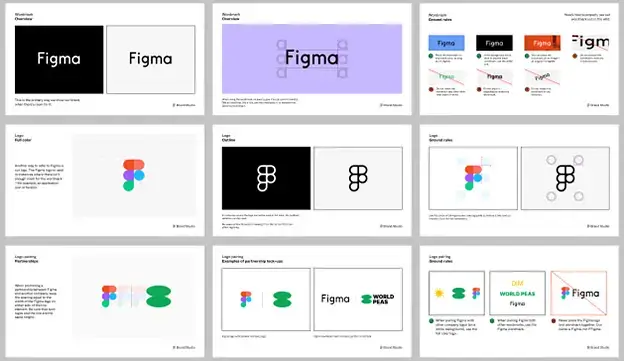
Here is an extract from the Brand Guidelines (Brand Style Guide) of FIGMA –
Let’s take one step at a time. First, identify the Branding challenges of startups and software tech companies.
What are the top Brand Strategy Challenges of New-age Digital Companies?
Startups and software tech companies go through constant makeovers of the product UI. Users from multiple countries and cultures access digital products – which sometimes call for local customization. A lot of competitors are in the same space, sometimes with little or no differentiation between the products. Acquiring a B2B enterprise client will need a lot of trust (social proof, testimonials, reviews, mentions) and a solid track record.
In this context let’s focus on three Brand Strategy Challenges –
Challenge 1: Digital Business vs. Physical Business
The digital nature of startup businesses means your brand isn’t anchored by a physical product or location. Your brand identity becomes your anchor, helping customers recognize, remember, and resonate with you.
The process for designing and executing brand guidelines for a startup company is going to be different. Designing for Kellogg’s isn’t the same as designing for a startup company’s collaterals.
Tech company represents a digital product whose value can’t be physically touched. The sales & marketing content will include – a landing page, product UI designs (FIGMA files), presentations, lead magnet prompts, newsletters, social media posts, videos, etc.
Challenge 2: No dedicated team on Brand & Communications
Large companies with stable ARR (annual recurring revenue) and funded Tech companies, usually have a dedicated “Brand & Communications” team. They have creative directors, visual designers, social media managers, etc. The team handles all the creative design work, marketing collaterals, and all tasks around Brand Identity.
Small companies, early-stage startups, and lean startups looking to optimize their funds are different. They might not have a dedicated creative team that has the bandwidth to do design in line with branding guidelines. One person does all, and THAT can be overwhelming. The result is shortcuts and inconsistency in following brand guidelines.
Sidenote: If you haven’t heard about Creatives-as-a-Service, check out Content Beta on-demand team of project managers, creative directors, visual artists, copywriters, and video editors. Click Here. Get all under one roof. You can solve the occasional bandwidth issues and event-related spikes in creative requests.

Challenge 3: Critical Marketing Ops suffer
Since the brand guidelines are not exhaustive and detailed, there is a lack of clarity. Even if brand style guide exist, the small marketing team lacks the bandwidth to create brand-compliant content assets on GTM (go-to-market), new feature launches, and social media posting.
Sidenote: We released our latest Go-To-Market (GTM) Playbook 2025. It has exhaustive insights on product launch and go-to-market fit from PMMs, CMOs, Marketing Managers, Directors of Content Marketing, GTM experts, and Founders. Click Here to get it. It includes detailed research on –
- Content assets that differentiate your company,
- Best channels for attracting leads,
- Prompts to get new prospects to try,
- Success Metrics of a GTM Strategy,
- Learning from actual GTM campaigns, and much more
The MOST Updated Branding Checklist of 2025
We have analyzed the brand guidelines of 50+ online companies to create the most updated Branding checklist of 2025. Here is the summary of the checklist –
- Logo
- Color
- Typography
- Brand Icons
- Illustrations
- Photography and Stock Photo (imagery)
- Graphic design
- Product screenshots and UI images
- Animation and Motion
- Sound effects, Background Music, and Voiceover
- Layouts and Grids
- Collateral
- Email Signature
- Legal guidelines
- Merchandise
- Mission, Vision, and Purpose
- Brand Philosophy
- Brand Values and Brand Persona
Here is a more detailed version of the LOGO Brand Guidelines Checklist –
| No. | Checklist for LOGO | Check |
|---|---|---|
| 1. | Primary and Secondary version | |
| 2. | Logo lockups | |
| 3. | Logo construction principles | |
| 4. | Logo - Inverted version | |
| 5. | Logo color palette | |
| 6. | Logo on dark or light background | |
| 7. | Co-branding or partner logo | |
| 8. | Usage principles | |
| 9. | Logo misuse | |
| 10. | Logo clear space | |
| 11. | Optical scaling | |
| 12. | Minimum size | |
| 13. | Trademark and Copyright usage | |
| 14. | Wordmark | |
| 15. | Brand Icon | |
| 16. | Logo Tagline (one-liner message) | |
| 17. | Use of the logo in different mediums | |
| 18. | Logo placement | |
| 19. | Logo file formats | |
| 20. | Typography and Font guidelines | |
| 21. | Logo design principles |
Here is a more detailed version of the COLOR Brand Guidelines Checklist –
| No. | Checklist for COLOR | Check |
|---|---|---|
| 1. | Brand colors/core colors | |
| 2. | Primary color palette | |
| 3. | Secondary color palette | |
| 4. | Accent colors | |
| 5. | Grayscale | |
| 6. | Gradient | |
| 7. | Usage chart |
Here is a more detailed version of the TYPOGRAPHY Brand Guidelines Checklist –
| No. | Checklist for TYPOGRAPHY | Check |
|---|---|---|
| 1. | Primary typeface | |
| 2. | Primary typeface fallback | |
| 3. | Secondary typeface | |
| 4. | Accent typeface | |
| 5. | Font weight | |
| 6. | Font sizes | |
| 7. | Typography hierarchy | |
| 8. | Usage guidelines | |
| 9. | Responsive typography | |
| 10. | Typography examples | |
| 11. | Font colors | |
| 12. | Web vs. print | |
| 13. | Line spacing | |
| 14. | Special character |
Here is a more detailed version of the BRAND ICONS Brand Guidelines Checklist –
| No. | Checklist for BRAND ICONS | Check |
|---|---|---|
| 1. | UI icons | |
| 2. | App icons | |
| 3. | Web icons | |
| 4. | Pictograms | |
| 5. | Device icons | |
| 6. | Photo-realistic icons | |
| 7. | Editor icon | |
| 8. | Icon guidelines |
Here is a more detailed version of the ILLUSTRATION Brand Guidelines Checklist –
| No. | Checklist for ILLUSTRATION | Check |
|---|---|---|
| 1. | Line art illustration | |
| 2. | Fluid art illustration | |
| 3. | Hero illustration | |
| 4. | Spot hero illustration | |
| 5. | Spot illustrations | |
| 6. | Meeples | |
| 7. | Principles | |
| 8. | Technical guidelines | |
| 9. | User and team representation | |
| 10. | Human representation | |
| 11. | Illustration’s misuse |
Here is a more detailed version of the PHOTOGRAPHY & STOCK PHOTO (IMAGERY) Brand Guidelines Checklist –
| No. | Checklist for PHOTOGRAPHY & STOCK PHOTO | Check |
|---|---|---|
| 1. | Campaigns | |
| 2. | Customer story | |
| 3. | Lifestyle | |
| 4. | On-device | |
| 5. | Technical aspects |
Here is a more detailed version of the GRAPHICS Brand Guidelines Checklist –
| No. | Checklist for GRAPHICS | Check |
|---|---|---|
| 1. | Shapes | |
| 2. | Elements | |
| 3. | Fills and effects | |
| 4. | Overlay | |
| 5. | Accents | |
| 6. | Treatment |
Here is a more detailed version of the PRODUCT SCREENSHOTS AND UI IMAGES Brand Guidelines Checklist –
| No. | Checklist for PRODUCT SCREENSHOTS AND UI IMAGES | Check |
|---|---|---|
| 1. | General |
Here is a more detailed version of the ANIMATION & MOTION Brand Guidelines Checklist –
| No. | Checklist for ANIMATION & MOTION | Check |
|---|---|---|
| 1. | Guidelines | |
| 2. | Elements | |
| 3. | Approach | |
| 4. | References |
Here is a more detailed version of the SOUND EFFECTS, BACKGROUND MUSIC & VOICEOVER Brand Guidelines Checklist –
| No. | Checklist for SOUND EFFECTS & MUSIC | Check |
|---|---|---|
| 1. | General |
Here is a more detailed version of the LAYOUT/GRID Brand Guidelines Checklist –
| No. | Checklist for LAYOUT/GRID | Check |
|---|---|---|
| 1. | Grid | |
| 2. | Frame | |
| 3. | Arrangement | |
| 4. | Examples |
Here is a more detailed version of the COLLATERAL TEMPLATES Brand Guidelines Checklist –
| No. | Checklist for COLLATERAL TEMPLATES | Check |
|---|---|---|
| 1. | General |
Here is a more detailed version of the EMAIL SIGNATURE Brand Guidelines Checklist –
| No. | Checklist for EMAIL SIGNATURE | Check |
|---|---|---|
| 1. | General |
Here is a more detailed version of the LEGAL GUIDELINES Brand Guidelines Checklist –
| No. | Checklist for LEGAL GUIDELINES | Check |
|---|---|---|
| 1. | Logo | |
| 2. | Trademark | |
| 3. | Company name | |
| 4. | Email signatures |
Here is a more detailed version of the MERCHANDISE Brand Guidelines Checklist –
| No. | Checklist for MERCHANDISE | Check |
|---|---|---|
| 1. | General |
Here is a more detailed version of the MISSION, VISION & PURPOSE Brand Guidelines Checklist –
| No. | Checklist for MISSION, VISION & PURPOSE | Check |
|---|---|---|
| 1. | Mission, Vision, and Purpose | |
| 2. | Brand philosophy | |
| 3. | Brand values | |
| 4. | Brand personality |
Guide to Brand Guidelines Checklist (with examples)
Here is where we’ll show you with examples, what each element of the items listed in the Brand Guidelines Checklist looks like.
A. Logo
When you’re crafting Brand Guidelines for designing and using Logo, consider these key aspects –
1. Primary & Secondary versions
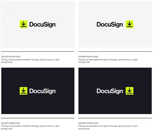
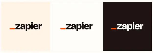
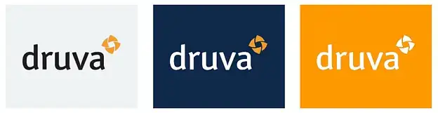
Clearly define the primary and secondary versions of the logo, such as full-color, monochrome, reversed, and simplified, with guidelines on when to use each. See these examples from DocuSign, Zapier, and Druva –
2. Logo lockups
Specify the protective field (extra space), and the letter spacing. See these examples from Semrush, Zapier, and Avalara –
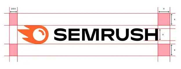
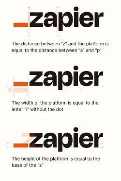
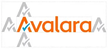
If the logo has variations that include taglines, icons, or other elements, provide guidance on their usage and combination rules.
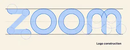
3. Logo construction principles
Specify the design principles used in constructing the logo. See this example from Zoom –
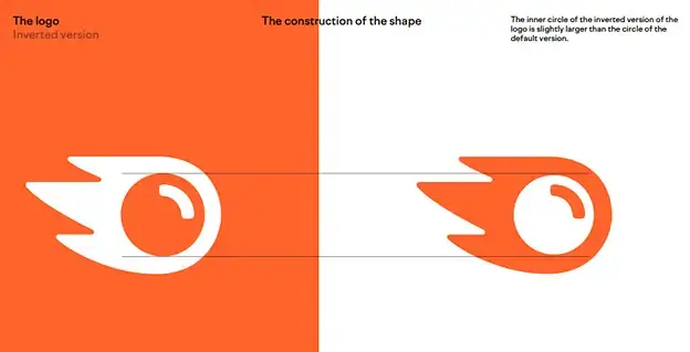
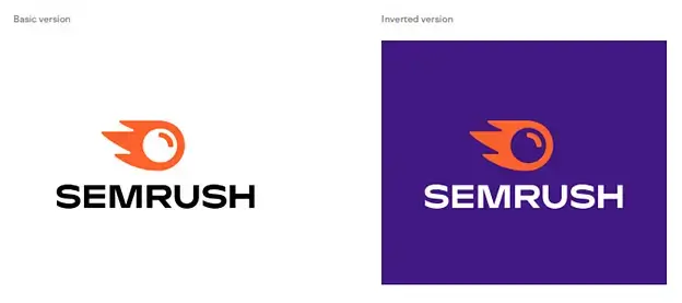
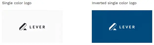
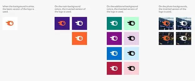
4. Logo - Inverted version
Share how the logo will be used if the color of the logo has interchanged with the background color or with a different background. See these examples from Semrush & Lever –
5. Logo color palette
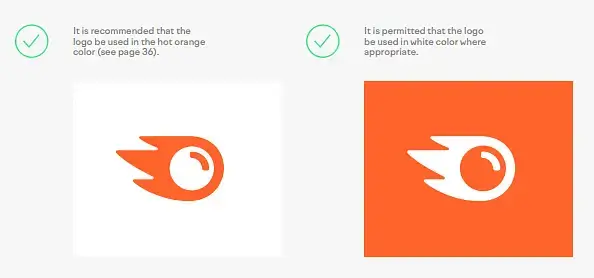
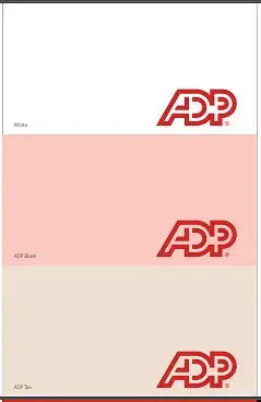
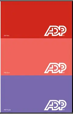
List the logo’s official color codes and guide on when to use each color, ensuring consistency across all applications. Pay special attention to the background. Check these examples from Semrush and ADP –
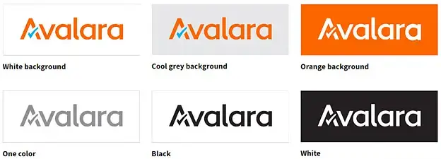
6. Logo on dark or light backgrounds
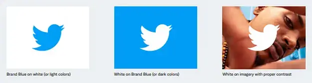
Specify how your logo should be used on dark or light backgrounds to ensure that it’s always visible and legible. See these examples from Semrush, Twitter, and Avalara –
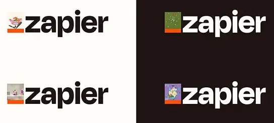
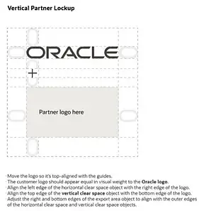
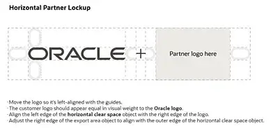
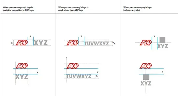
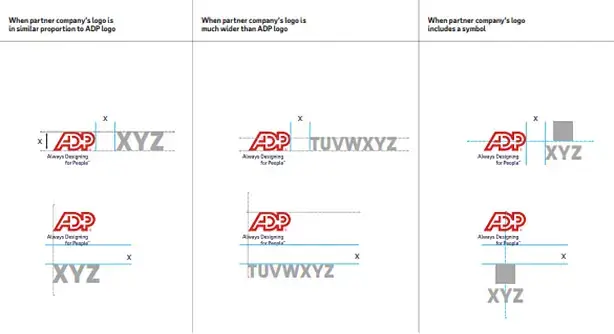
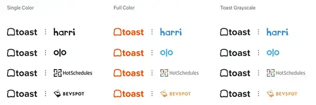
7. Co-branding or Partner logos
If the company has any partnerships or collaborations, explain how the logo should be used in co-branded materials. See these examples from Zapier, Oracle, ADP, and Toast –
8. Usage principles
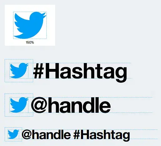
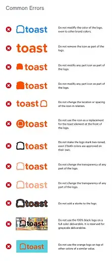
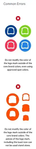
Clearly show examples of Dos and don’ts. Include usage principles related to color, background, etc. See these examples from Twitter, Zoho, and Toast –

9. Logo misuse
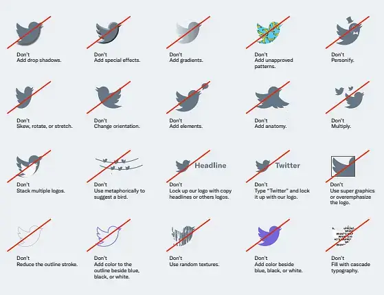
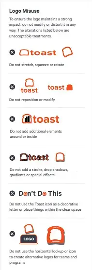
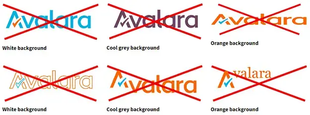
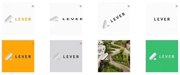
Give examples of common logo misuse, such as stretching, rotating, or altering the colors, and explain why these should be avoided. Include guidelines on prohibited logo modifications or alterations. See these examples from Twitter, Zoho, Toast, Avalara, and Lever –

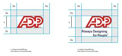
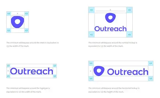
10. Logo clear space
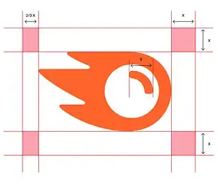
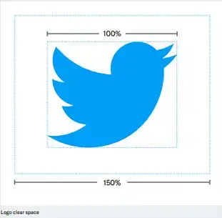
Specify the minimum clear space around the logo to ensure it’s not cramped or cluttered by other elements. See these examples from Semrush, Twitter, ADP and Outreach –
11. Optical scaling
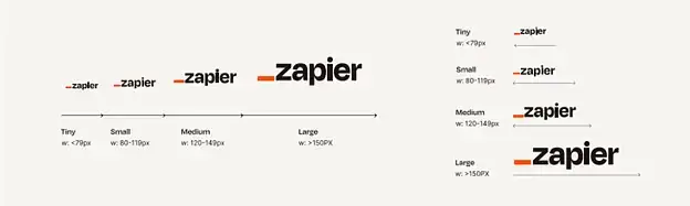
Optical sizing is the practice of designing different versions of a logo. This can be standardized. See this example from Zapier –
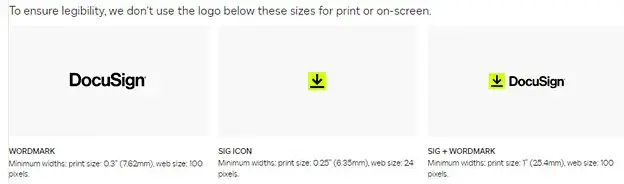
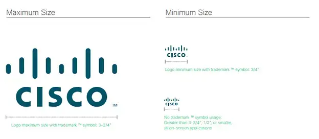
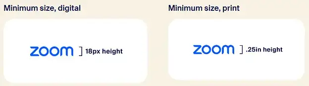
12. Minimum size
Set the minimum size requirements for the logo to maintain legibility and visual impact. See these examples from DocuSign, Cisco, and Zoom –
13. Trademark and copyright usage
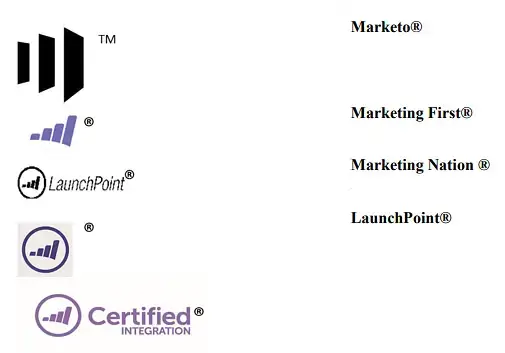
Provide instructions on proper trademark and copyright symbol usage in the context of the logo. This is where you outline the legal protections that your logo has and how it can be used legally.
Here is an example of Marketo –
14. Wordmark
Wordmark is also known as logotype. It refers to a unique text treatment for a name of a specific company, institution, or product. It’s used without any symbols, mascots, or badges. Here are some examples of Semrush, Zendesk, and Docusign –
15. Brand Icon
A brand icon symbolizes the essential processes, traits, and services of the brand in a visual, easy to grasp format. Let’s look at a few examples from Docusign, Semrush, Toast, and Survey Monkey –



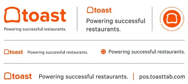
16. Logo Tagline (one-liner message)
It is a brief, catchy phrase that efficiently communicates what the brand stands for. The examples of Toast and Avalara show a few ways to attach a message/tagline to a brand logo –

17. Use of the logo in different mediums
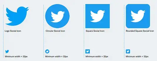
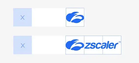
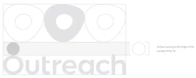
This is where you define how your logo should be used across different mediums, such as print, digital, and across various social media platforms. Let’s take a look at some examples from Twitter, Zscaler, and Outreach –
18. Logo placement
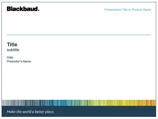
Provide guidance on where and how the logo should be placed on various materials, such as websites, print materials, and presentations. Include detailed guidelines on how to use the logo on different collateral, such as business cards, letterheads, and flyers. Let’s have a look at the example from Blackbaud –
19. Logo file formats
Specify the appropriate file formats for various applications, such as print (vector-based files like EPS or PDF) and digital (raster-based files like PNG, JPEG, or SVG).
20. Typography and font guidelines
This is where you outline the fonts that should be used alongside your logo and how they should be used in different contexts.
21. Logo design principles
This is where you outline the design elements that make up your logo and how they work together to create a cohesive visual identity.
Example – The symbol for Semrush is a fireball, a sign of energy that fuels marketing dynamics.
B. Color
When you’re crafting Brand Style Guides for deciding on the color and how the palette will be used, consider these key aspects –
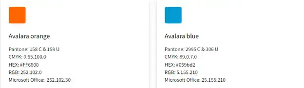
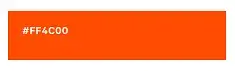
1. Brand colors/core colors
These are the main colors that represent the brand and its main attributes, such as logo, brand icon, etc. Let me present some examples from Avalara and Toast for clarity.
2. Primary color palette
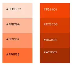
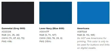
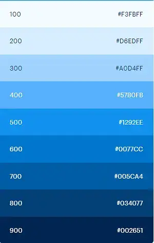
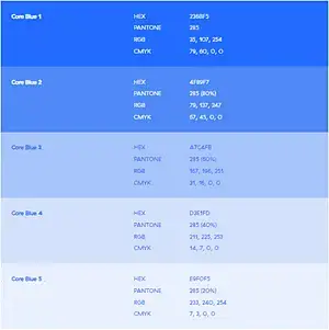
These colors are used most frequently in the brand’s visual elements. Define the specific shades using RGB, CMYK, HEX codes, and/or Pantone references if possible. Here are a few specific examples from Toast, Lever, Help Scout and Zscaler –
3. Secondary color palette
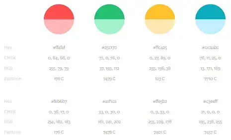
These are complementary colors used to support the primary colors. They provide variety and give depth to the palette. Similar to the primary color palette, define the specific shades using RGB, CMYK, HEX codes, and/or Pantone references if possible. Lets showcase some examples from Outreach and Help Scout –
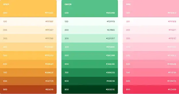
4. Accent colors
These are additional colors that are used sparingly to highlight or draw attention to certain areas. If it’s possible, describe the particular shades using RGB, CMYK, HEX codes, or Pantone references. Here are some instances from Toast and Lever –
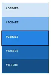
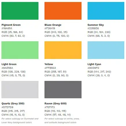
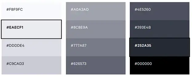
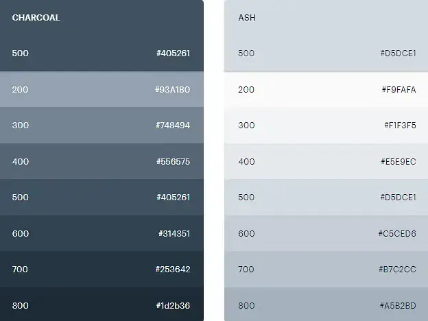
5. Grayscale
It is a part of the primary color palette or even the brand colors/core colors at times. These are used in most brand deliverables. Let’s observe a few examples from Outreach, Toast, and Help Scout –
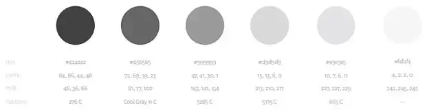
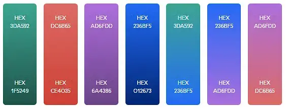
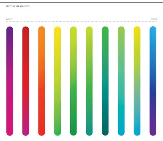
6. Gradient
Define the directions, colors, number of colors, and transition points for the gradients. Consider the examples from Zscaler and Cisco here –
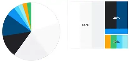
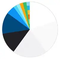
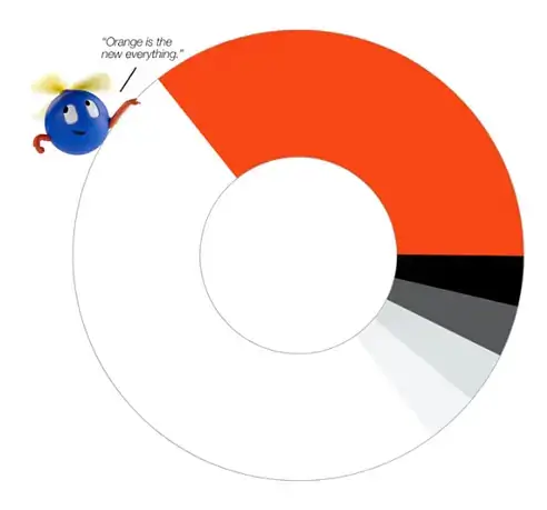
7. Proportional color usage
This chart illustrates the approx ratios of the colors in the brand color palette. This is for guidance. These examples are from Lever and UiPath.
C. Typography
When you’re crafting Brand Guidelines for fonts and how will they be used, consider these key aspects –
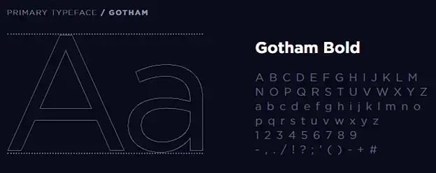
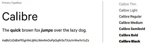
1. Primary Typeface
This is the main typeface used in your brand’s communications. It can be a custom typeface or one that’s readily available. Include guidelines for its usage and where it can be downloaded or purchased if necessary. Let’s dive into the examples of SentinelOne, Toast, and Avalara –


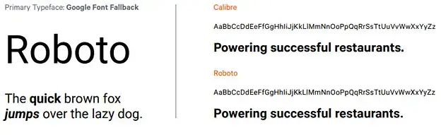
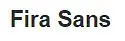
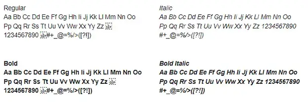
2. Primary Typeface Fallback
In some cases, an alternative font may be needed. For instance, these font alternatives can be used when creating branded documents in the Google Suite. Take a look at the examples from Toast and Lever –
3. Secondary Typeface
This is the supporting typeface that complements the primary one. This could be used for subheadings, captions, or other specific contexts. Here are a couple of exams from SentinelOne and Avalara –
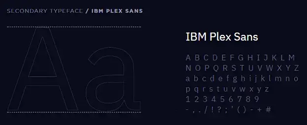
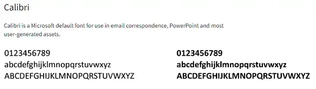
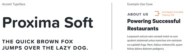
4. Accent Typeface
These might be used for special cases, such as code snippets, quotes, or other specific contexts where the primary or secondary typefaces don’t work as well. This particular example from Toast also shows a use case –
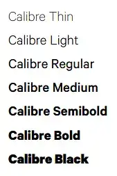
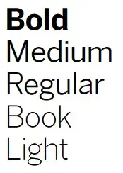
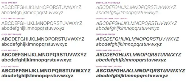
5. Font Weights
Define the specific weights (light, regular, medium, bold, etc.) to be used and in what context each should be applied. These examples are taken from Toast, Qualtrics, & Cisco –
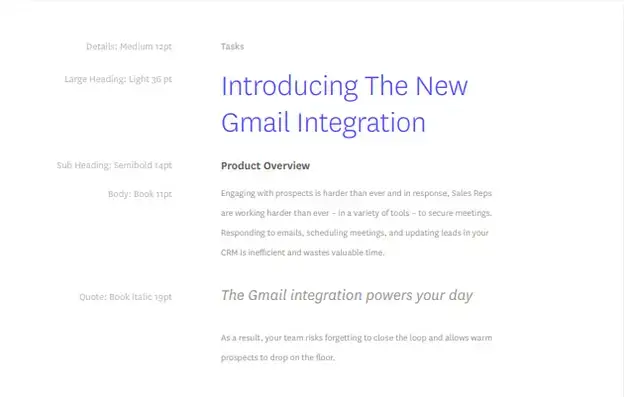
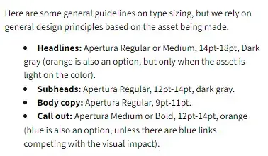
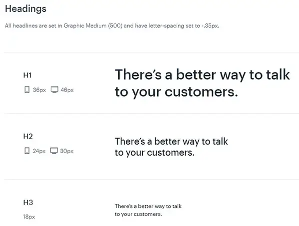
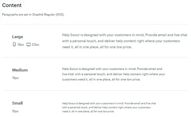
6. Font Sizes
Specify font sizes for different elements like headlines, subheadings, body text, captions, etc. The examples mentioned below are from Outreach, Avalara and Help Scout
7. Typography hierarchy
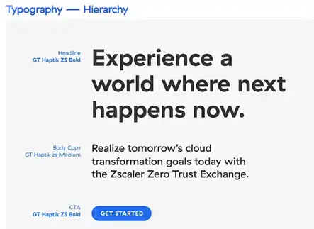
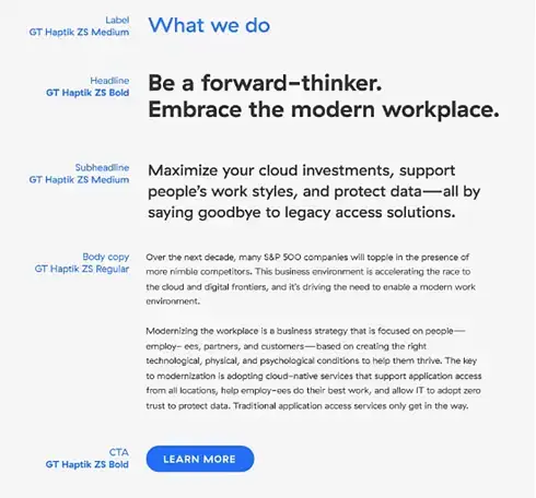
It’s all about how the different text elements interact and relate to one another.
Zscaler has provided a detailed example here –
8. Usage guidelines
Provide guidelines of how your typography should look in different contexts, such as on your website, in print, etc. The examples here are from Zoom and UiPath –
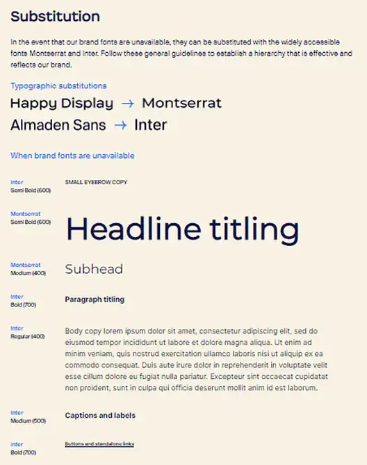
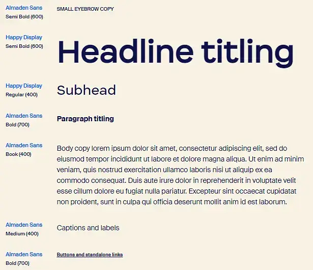
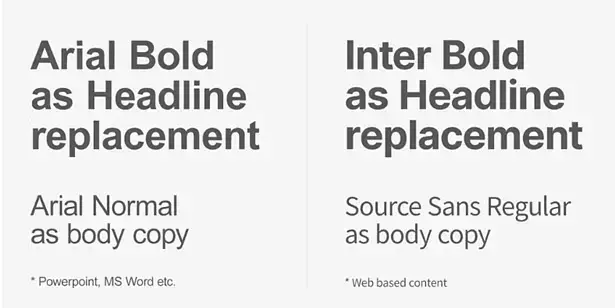
9. Responsive Typography
For digital platforms, provide guidance on how typography should adapt to different screen sizes. This particular example is from Avalara –
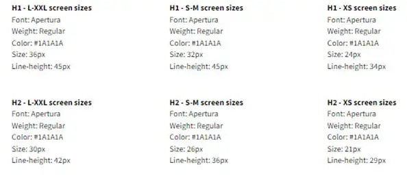
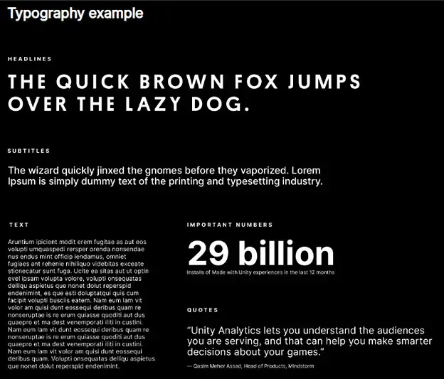
10. Typography example
Here is an example of titles, subtitles, text, numbers etc.
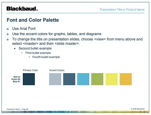
11. Font Colors
Specify which colors from your color palette should be used for different types of text. The example mentioned below is from Blackbaud –
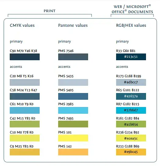
12. Web vs. Print
If there are differences in typefaces for print and digital platforms, make sure to make this clear. The example here is provided by Blackbaud –
13. Line Spacing
Provide guidance on line spacing, paragraph spacing, and letter spacing to ensure readability and consistency.
14. Special Characters
Provide guidelines for the use of special characters, numbers, and punctuation in the chosen typefaces.
D. Brand Icons
When you’re crafting Brand Style Guides to set standards how icons will be used, consider these key aspects –
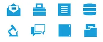
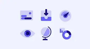
1. UI Icons
These are graphic symbols that stand for a function, a concept, a specific thing, and the whole application. The examples presented below are from MuleSoft and Monday –
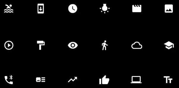
2. App Icons
It is a specific image that symbolizes an app on a person’s device. It is also known as an app logo. The one featured here is from Unity –
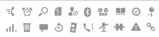
3. Web Icons
A web icon represents the theme or category of information. They visually break the content into bite-sized pieces, making it less scary. The example is from Proofpoint –

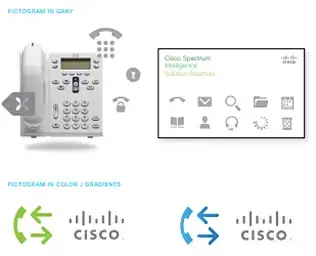
4. Pictograms
A web icon represents the theme or category of information. They visually break the content into bite-sized pieces, making it less scary. The example is from Proofpoint –
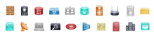
5. Device icons
A web icon represents the theme or category of information. They visually break the content into bite-sized pieces, making it less scary. The example is from Proofpoint –
6. Photo-realistic icons
A web icon represents the theme or category of information. They visually break the content into bite-sized pieces, making it less scary. The example is from Proofpoint –
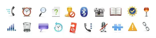
7. Editor icon
A web icon represents the theme or category of information. They visually break the content into bite-sized pieces, making it less scary. The example is from Proofpoint –
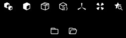
8. Icon guidelines
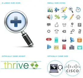
Scale – icons must be of a fitting size, clear to see but not too bold or dominating.
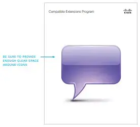
Clear space – the part surrounding an icon, needs to remain clear to let the icon stand out.
Color usage – Color usage is crucial; icons need to match the brand’s colors to ensure a harmonious look and enhance brand recall
E. Illustration
When you’re crafting Brand Guidelines to help your design team understand how to use illustrations, consider these key aspects –
1. Line art illustration
It is the practice of creating a picture using only basic lines of different weights and angles. It avoids shading or gradient and focuses exclusively on lines. The example is from UiPath (not UIPath or Uipath)

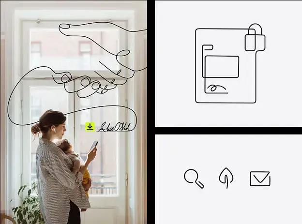
2. Fluid art illustration
Fluid line illustration is an artistic style that employs curving, flowing lines to create dynamic, often abstract imagery. It mimics the natural movement of liquids (or signatures for Docusign). This style brings out vibrant visuals that are full of life. Here is an example from DocuSign.
3. Hero illustration
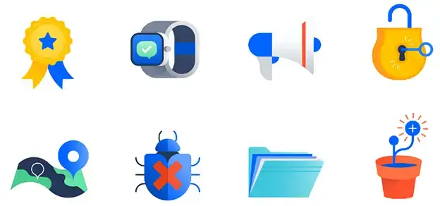
Hero illustrations are about telling big stories. They’re often filled with symbolism and fantasy. They show teamwork, success, and positivity. Typically, a large central object is the focus, surrounded by a team. The example mentioned below is from Atlassian –

4. Spot hero illustration
Spot heroes are simplified versions of hero illustrations. They work best when you need to deliver a strong message in a small space. They often illustrate a single concept in a more literal way. We have provided an example here from Atlassian –

5. Spot illustration
Spot illustrations are the most simple and literal depiction of a concept. They’re small, basic, and typically don’t include people. But it might include some background elements depending on the design. Have a look at the example of spot illustration from Atlassian –
6. Meeples (headshot of a character)
Meeples are a standalone category, created in both high-quality and simple versions for maximum versatility. They can be utilized alone or merged with other illustrations. Let me provide some examples in various instances –
- Full-sized meeples – When speaking about ‘Bob’, ‘a customer’, ‘my team’, or ‘me’, more easily recognized symbols are needed than low-quality parts of a bigger idea. That’s why full-size meeples are more human-like and crafted to be seen as actual people instead of symbolic figures.

- Simplified meeples – When you’re working with limited space or a complex setup, use simpler meeples. They help present individuals and teams in a less intricate fashion.

- Meeples scene – Occasionally, we need to show people in settings that create a narrative and establish a background. These scenes position meeples in relatable settings. It is useful when you want to illustrate personal connections.

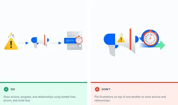
7. Principles
The basic graphic design principles that are relevant for brand illustrations are –
- Keep the art style Uniform
- Your illustrations should match the vibe of your brand
- Size of the illustration matters
- Illustrations should get the message across right away
- Use brand colors in illustrations to reinforce your brand
- Spread elements out and try to create balance
8. Technical guideline
Geometric shapes: We suggest incorporating geometric shapes to communicate abstract ideas, particularly those found in the brand pattern.
Colors: The colors used in illustrations should align with the brand’s primary color palette. It maintains consistency and reinforces brand identity.
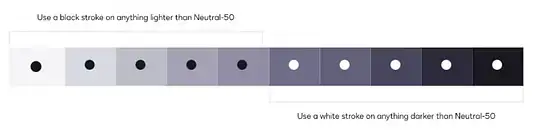
Stroke Color: The suitable stroke color for illustration is determined based on how bright or dim the background appears.
9. User and team representation
User and team representation is all about including diverse figures that reflect the brand’s audience or workforce in its illustrations. It should resonate with the brand’s values and principles and reflect a positive, inclusive, and accurate portrayal of users or teams.
10. Human representation
Incorporating human characters in the blog cover design can make the content less technical and more engaging. We recommend basing these characters on the simple geometric shapes found in the brand’s pattern.
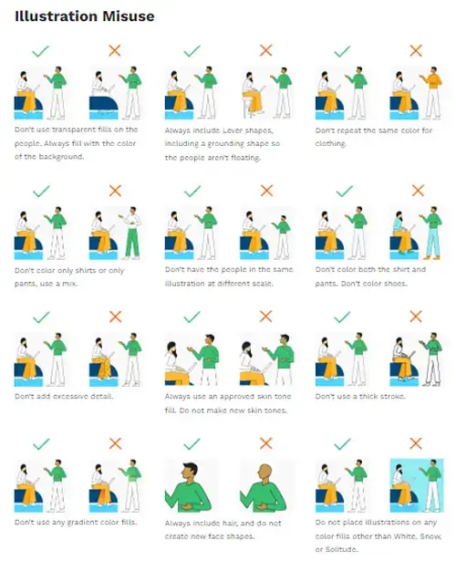
11. Illustrations misuse
It refers to the incorrect use of the brand’s illustrations. It can be messing with the colors, stretching them out of shape, or just placing them somewhere inappropriate. This specific example is from Lever.
F. Photography / Stock Photo (imagery)
When you’re crafting Brand Style Guide on how to use stock photos and images, consider these key aspects –
1. Campaigns
Photos for campaigns show happy, true moments and make things lively. They are made to look different from the usual brand photos.
You can use them in:
- Advertisements
- The homepage
- Social media pages
- Emails
Note – Use campaign photography for campaign purposes only.
Here is an example from DocuSign –

2. Customer story
When you include your customers in a picture, you are sharing their day-to-day experiences. The photos should capture this along with how the products/services make a difference in their lives, in big and small ways. Let’s consider an example from DocuSign –

3. Lifestyle
These photos provide a glimpse of life – real moments and situations. Choose scenes, backdrops, and features that can speak for themselves.
They’re good for:
- Advertisements
- The homepage
- Social media pages
- Emails
- Blog articles
- PR releases
Let me provide an example from DocuSign –

4. On-device
Device pictures show the products/services in the usual world of the customers. They are lifestyle photos that are neatly arranged with clear lines and soft materials (like wood). They sometimes show the customers in the process of signing up.
Put them in:
- Advertisements
- The homepage of the website
- Social media pages
- Emails
- Blog articles
Let’s check this example from DocuSign –

5. Technical aspects
Here are some technical aspects of photography –
Lighting – In photography, lighting is a major factor as it sets the mood, and impacts the depth and other finer details. The direction, brightness, and color of the light can really make a difference in how the subject appears in the picture. It’s ideal to use a natural source of light.
Color – To convey the right mood through your photography, it is important to choose colors thoughtfully. So, try to maintain a balance of light and dark backgrounds. Refer to the brand color guide for inspiration.
Tone – Decide the tone of your photography. This will depend on the brand’s aesthetics and the focal point of the photograph. To achieve the desired effect, use fill and rim lighting accordingly.
Composition – Well-arranged visual elements within a frame can create a balanced and engaging image. It can be done through various techniques such as the rule of thirds, leading lines, symmetry, and depth. Good composition guides the viewer’s eye to the subject, conveying a story, emotion, or idea effectively.
Editing – Use this process to enhance the main objective of the photograph. This might include modifying components like brightness, contrast, saturation, and sharpness, along with methods like retouching, cropping, or the application of filters.
G. Graphic designs
When you’re crafting Brand Guidelines to set clear dos and donts for designing and using graphi designs, consider these key aspects –
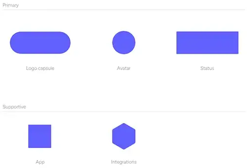
1. Shapes
Make use of the shapes to draw attention to the primary asset.
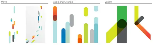
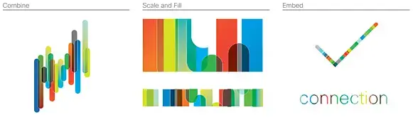
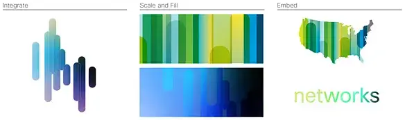
2. Elements
Derived from the logo or brand icon. This specific example is from Cisco –
3. Fill and effects
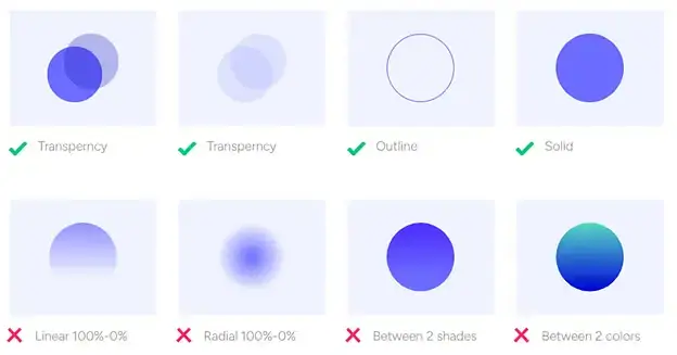
It refers to the color inside your shapes (that’s your fill), and any fancy stuff like gradients, shadows, or textures (those are your effects). These elements are crucial to maintain branding consistency and recognition across different mediums and platforms.
4. Overlay
In the graphics world, “overlay” refers to an element or a layer that is placed over an existing image, graphic or background. It could be a color, a design, a cool gradient, or even some words. The purpose is adding some extra depth, focus, mood or style to your graphic.

5. Accents
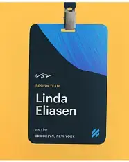
It’s a graphic element that is used to draw attention or add emphasis to a particular area or object. It could be a bold color, a funky shape, or something that sticks out from the rest. These are used sparingly to maintain visual balance. This specific example from Help Scout uses brush strokes as an accent –
6. Treatments
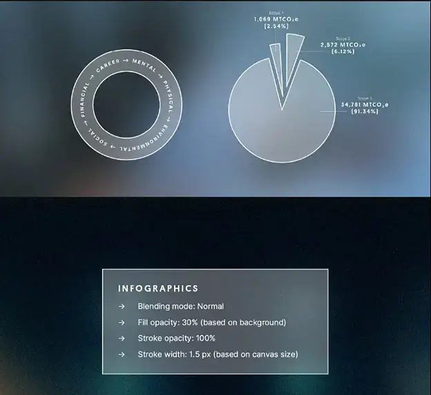
It refers to the specific way graphical elements are manipulated or presented. It could be playing with colors, adding some gradients, and opacity, giving texture, or adding in some shadows. It’s about making sure our visuals have the same vibe across the board.
As you can see in the example below –
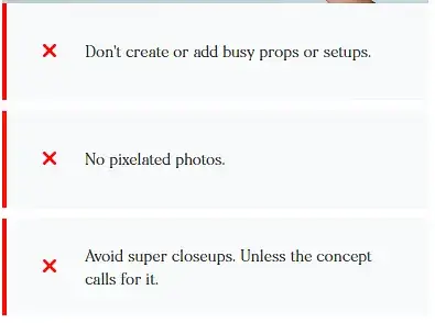
- With blurry pictures, white’s your go-to for text, callouts, and even those CTAs and data visuals.
- Ensure the opacity for the outlines is 100% and play around with the opacity for the fills.
- Apply a ‘Soft Light’ blend to the less opaque fills to highlight them
H. Product screenshots and UI images
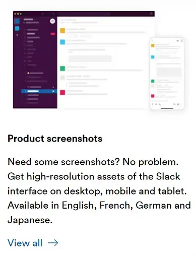
Product UI is about giving your digital product a visual boost. It involves a thoughtful selection of fonts, colors, animations, etc. These design choices create a user-friendly, visually pleasing, and engaging user experience.
Slack has a dedicated section on Product Screenshots. Click Here to check this link from its media kit.
I. Animation and Motion
When you’re crafting Brand Guidelines for “Animation and Motion”, consider these key aspects:
1. Guidelines
Usage: Clearly specify where and when to use (or not use) animations.
Style: Start by defining the overall aesthetic and style of your animations. What’s your animation vibe? Flat or 3D? True-to-life (realistic) or more like Picasso (abstract)? Lay this down as your base. Ideas like anticipation, overshoot, squash and stretch, and overlapped timing assist the viewer’s focus and infuse life into rigid forms. But don’t go overboard – stay away from cartoon-like effects. A quick tip: Work more efficiently by using workflow plugins for After Effects.
Color Palette: Outline the colors to be used in animations. These should be consistent with your overall brand color scheme.
Movement: Provide guidelines on how elements should move. This includes things like the speed of movement, easing, and transitions. Secret Strategy: It’s not necessary to animate every point in a sentence or paragraph. Pay attention to the key points.
Tick-Tock (Timing): Lay down the law on the timing of animations. How long should transitions take? How fast or slow should your animations be?
If you’re a SaaS company, your animation style could be flat and minimalistic, using your brand’s primary and secondary colors. Movements could be smooth and quick to keep users engaged but not distracted. Transitions might last no more than 0.5 seconds to ensure a brisk and efficient user experience. E.g., click here to check this fast-paced video on our pricing page. It uses the STOMP effect (text) with the right music beats.
Want to see examples?
Click Here to check out our video examples page. It has 30+ examples of how Brand Guidelines have been used to create product explainer videos, product demo videos, video testimonials, how-to videos, re-purposed videos, video ads, and B2B marketing videos.
2. Elements
- Transitions,
- Color palettes,
- Brand signature,
- Photography,
- Short headlines,
- Title treatments,
- Logo treatment, and
- Flexible asset ratio sizes
3. Approach
The overall motion strategy should be purposeful and straightforward, avoiding unnecessary decoration and complexity. Each narrative should present a clear message, with simple choices in typography, graphics, and transitions. There are charming messages and principles to share through motion, and each item should deliver powerful engagement.
4. Include References for Animators
Motion Grid – With a layout of a 60×60 px grid and 60 px margins, the motion grid provides maximum flexibility. You can choose the number of columns depending on each project. This grid can act as a base for any motion project in 16:9, 1:1, or 9:16 formats.
Framing -> Focus shifts – By using a blur with noise, switch focus between the framed content and its background, underlining different subjects.
Framing -> Scale – This is meant for the transition between full-screen and frame-inside-frame content.
Framing -> Slices – This is for vertically extended content slices. The full stretch takes place along the shortest edge.
Framing -> Slides – Apply this for sliding frames into visibility or keeping them stationary with footage included. Use the grid to design new layouts.
Titles -> Tracking – This is for stretching and squeezing the spacing between letters. It’s effective for single-word phrases as well as extended lines of text.
Titles -> Leading – Use this to play with the spacing between lines for a fun look.
Titles -> Unmask – Use this to reveal text from the bottom. It goes well with sliding frames.
Titles -> Squares – This is useful for creating repetitive motion of text along the edges of the frame. It brings a fun animation effect to short, identifiable words.
Arrows -> Simple Arrow – This can be used to bring creativity into layouts and interactions. The arrow nudges the ‘call-to-action’ text.
Arrows -> Push Arrow – Make use of this to explore creativity in structures and interactions. The arrow communicates with the text.
Cassettes – Make use of vertical cassettes for compact, secondary information along the shortest boundary of the design.
J. Sound effects, Background Music & Voiceover
When you’re crafting Brand Style Guide to set standards on how to use sound effects, background music, and video voiceover, consider these key aspects –
- Sound Effects: Create guidelines around the usage of sound effects. When should they be used? What kind of effects fits your brand identity? Get down to specifics: volume, duration, and style.
- Background Music: Determine when and where background music should be used. What genres or vibes groove with your brand? Don’t let the music steal the spotlight from other elements.
- AI-Voiceover: If you choose to use an AI-voiceover, set guidelines for the tone, speed, and accent of the AI voice. It’s gotta align with your brand persona.
- Human-Voiceover: If a human voiceover is preferred, give some pointers on what kind of voice you’re after (think gender, age, accent) and how it should perform (like pacing, tone, and emphasis).
K. Layout / Grids
It provides structure and order to a design composition. Layout ensures the content is strategically positioned, aligned, and visually proportioned to create appealing and balanced designs. It helps maintain visual harmony across different brand materials
1. Grid
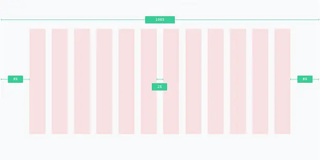
Apply a grid to set up uniformity and secure content. This is the base for creating hierarchy, balance, clarity, and structure. When laying out a grid, consider columns, rows, margins, and gutters.
- Columns – A twelve-column grid is a good starting point for your design. In the case of smaller formats such as digital ads or business cards, switch to a 6 or 4-column grid if necessary.
- Rows – In many digital applications, the height is not set. It makes rows less necessary. However, for applications with a defined height, rows are used to arrange the content.
- Margins – Pay careful attention to margins and don’t hesitate to use them freely. They serve as a comfortable “buffer” for content and help ensure text remains intact while printing. Set margins to be at least 8% of the width, or the shortest side if applicable.
- Gutters – Column gutters, or the spaces separating columns, should be at least 2% of the total width.
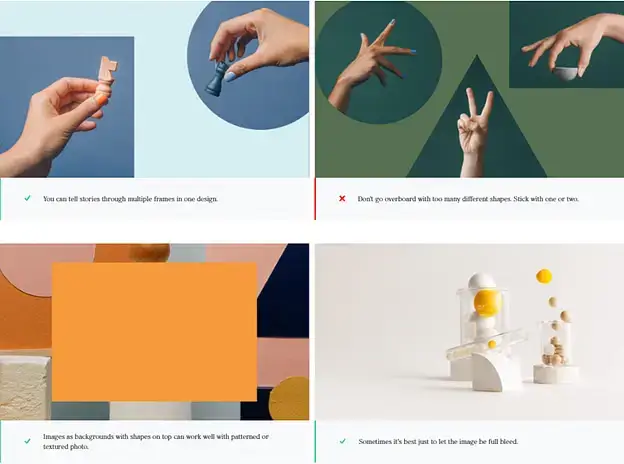
2. Frame
The use of shapes to frame images amplifies the story. They connect the abstract concepts of the product/service with the people who use them. This method works best for brand images of employees, and clients, and for still life imagery.
However, not all shapes are equally effective. Some photos stand out when cropped, while others are best left in their original rectangular form. Knowing your target frame before directing photography can be useful.
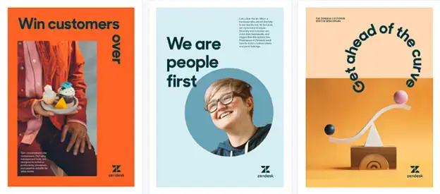
3. Arrangement
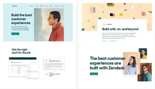
Develop layouts that are simple yet surprising. Use the grid in innovative ways to bring desired approach to your designs. Enhance your compositions by adding layers, rotating elements, and incorporating white space.
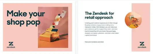
Observe how these guidelines help in designing your creative assets –
Poster/report cover
Webpages:
Campaigns:
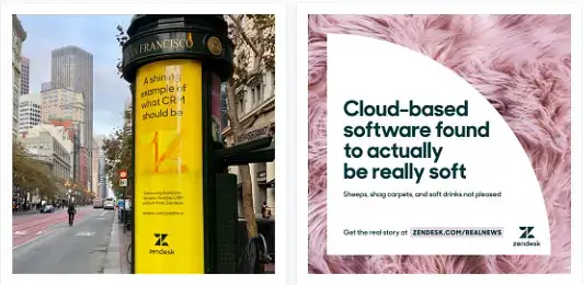
Postcards:
L. Legal Guidelines
In the context of legal boundaries, the Brand Guidelines could specify usage principles such as –
- Logo must be used correctly on websites, advertising, and other collaterals, avoiding usage in titles or meta tags, and in any unlawful or violent publications or websites.
- Emphasize the importance of displaying the logo independently and collectively, using the appropriate “®” or “™” symbol as directed, and using the logo’s exact form.
- Any intention to manufacture, distribute or sell merchandise with the logo is prohibited.
- Trademarks can be used when referring to the company’s products/services or indicating compatibility with them, but only by authorized partners.
- Modification of the trademark is strictly prohibited.
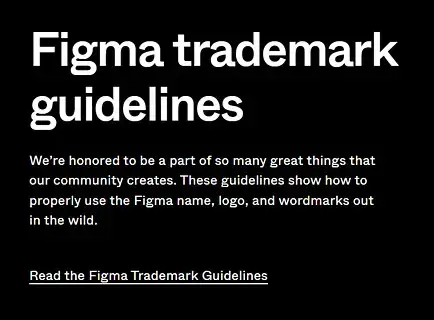
Click here to check these detailed guidelines from FIGMA
Also, refer “Logo” section for more details.
On a lighter note, there is always a trade-off between creativity and in-trend designs vs. legal guidelines –
Brands: We want to be disruptive. We will use the the latest social media trend. We want to go big on TikTok!
Same Brands, five minutes later: “Whoa, hold up! Respond to negative comments? Go outside our style guide? Post something without the legal giving it the nod? No way!
M. Email Signatures
In your Brand Guidelines for email signatures, you should include:
- The correct order of information: Name, title, company, contact information, and any relevant social media or website links.
- The use of brand colors, fonts, and logos: Specify how and where the company’s logo should appear in the signature, as well as any specific colors or fonts that should be used.
- The size and style of the text: Ensure that the text is easy to read and professionally styled.
- Any legal disclaimers or confidentiality notes: If your company requires these, provide the exact wording to be used.
- Samples: Provide a few examples of well-formatted email signatures adhering to the guidelines.
PS – “Sent from iPhone” is NOT a part of the email signature!
PPS – As much as you want to, avoid writing – “I wish to. I want to. And I will stay out of it.”
N. Merchandise
It’s important to lay down the usage guidelines around merchandise items such as wearables and gifts, business cards (“mini billboards”), event desk designs, t-shirts, stationery items, electronic gadgets, furniture, etc.
Click here to see how Pearson did it. Document name – Merchandise best
practices guidelines.
O. Collateral Templates
Provide templates for common types of brand collateral such as brochures, presentations, emails, newsletters, datasheets, infographics, whitepapers, graphs, social media posts, landing pages, etc. This ensures that all company materials present a cohesive brand image.
For example, Slack provides a range of templates with distinct color palettes and typography to ensure consistency across all communications.
Click Here to check out how DocuSign did this.
P. How important is Mission & Vision, and Purpose in the Brand Guidelines?
Mission and vision statements are like guiding stars. They direct the brand’s actions and decisions with its goals and values. On the other hand, purpose gives a brand its meaning and builds connection with consumers on a deeper level.
1. Mission Statement
It’s a short summary of what you do and why.
Look at Slack – their mission is “to make work life simpler, more pleasant, and more productive.” They’re all about turning the office chatter into a breeze and improving workplace communication.
2. Vision
This is your crystal ball prediction of where your company’s heading (read: long term).
Take Microsoft – their vision is “to help people and businesses throughout the world realize their full potential.” They’re not just about software; they’re about empowering the little guy (individuals) and the big corporations alike.
3. Purpose
It’s why your company gets up in the morning, and it’s not just about raking in the cash. The purpose statement is a broad declaration of your company’s reason for existence beyond making money. It can overlap with mission and vision but often has a broader, more philosophical scope.
Check out Atlassian – their purpose is “to unleash the potential of every team.” They’re not just selling tools; they’re creating a world where every team, big or small, can shine.
Q. How important is Brand Philosophy in the Brand Guidelines?
This is your company’s manifesto, the core beliefs that fire up your engines. The philosophy of a brand influences the company’s behaviors, acting as the company’s ethical guide.
Take HubSpot, their philosophy is “to help millions of organizations grow better.” They’re not just about selling software; they’re about fuelling customer growth.
R. How important is Brand Values and Brand Persona/Personality in the Brand Guidelines?
Brand values and brand persona/personality serve as the foundation for a brand’s identity. They shape the brand’s perception by guiding decision-making, adding human touch and building trust.
1. Brand Values
Brand values are the guiding principles that shape the behavior and actions of your company. The key values outline a brand’s nature and actions. It guides how others see the brand and the impact it makes. These are your company’s moral compass, the ideals that steer your ship.
Look at Salesforce. Their values? Trust, Customer Success, Innovation, Equality. It’s their way of saying, “This is how we roll.”
2. Brand Persona/Personality
A brand persona is a representation of your brand as a character. It’s like your brand’s alter ego. To create one, you start by getting to know your audience, “stalking” their behavior and tastes, and then mirroring these in your brand’s character.
Take Mailchimp. Their persona? Friendly, helpful, and slightly quirky. Just like their super user-friendly email marketing platform.
Case Study: How Content Beta created videos as per the Brand Guidelines of its clients?
Check out these instances where Content Beta created videos for its clients based on brand guidelines –
1. Client Name: Service Now
Learn how ServiceNow (enterprise software company) leveraged Content Beta’s on-demand creative design team for asset rebranding and all their design needs. Read more about the client briefing, brand style guides, turnaround times, and the need for zero-tolerance for errors. Click here to read more.
2. Client Name: ManyChat
Learn how ManyChat (marketing software) worked with Content Beta to create 150+ video course lessons for customer onboarding. The videos used B-rolls from the product UI and there was minimal hand-holding as our team is adept at quickly picking up the client software. Click here to read more.
3. Client Name: NachoNacho
Learn how NachoNacho (SaaS subscription management software) used Content Beta’s services to show users how to discover, manage and save on SaaS. To see how we converted the product docs into a Product Demo Video in < 10 days. Click here to read more.
For more such customer success stories, click here.
Ready Reference - Brand Identity guidebook of 50+ companies
At ContentBeta, we dug out brand guidelines/guide book of 50 SaaS and Software Tech companies. Here is the list (in no particular order) –
So, how do we solve the Branding Challenges of Startups and Online Companies?
At Content Beta, we believe in making complex stuff simple for customers of startups and B2B Software enterprises.
So here are three actionable tips to help you create brand guidelines in 2025 –
1. A checklist that never fails you.
We created a Brand Guidelines Checklist to include the smallest details in areas such as logo, color, typography, imagery, writing style, co-branding, and much more (with examples).
2. Don’t just tell me. Show me.
We curated examples for each checklist item from the brand style guide book of 50+ SaaS companies.
3. Put all samples in one place.
We created a repository of links to 50+ brand guidelines of different companies (mostly SaaS). It helps if you know what others are doing.
Which tools can help you create the Brand Guidelines faster?
There are some freely available tools that can help you access brand guidelines of other companies. Here is a short curated list –
1. CSS Peeper (Chrome Extension)
Curious about line height, font, button size, or color palette used on a website?
CSS Peeper (Chrome Extension) serves as an essential tool for designers and brand guidelines experts. It gives you easy access to other companies brand guidelines – color palette, font, images, etc. – from their websites. With a rating of 4.7 (300+ reviews) on the Google Chrome webstore and 400K+ downloads, this is worth a try.
2. HubSpot’s Brand Kit Generator
Get free logo design templates and unique color palettes. Personalize the elements of your brand. Create favicons and social media icons for your brand guidebook easily. Build a unique online presence for your company! Quick tip – try Wepik’s brand kit generator too. Click here.
3. COOLORS.CO
COOLORS is a free color palette generator. It also gives you access to trending color palettes. Do tons of A/B testing before you finalise the color palette for your brand identity.
4. Advanced Google Search
Use Advanced Google Search to search for PDF files from a specific website. Alternatively, use this framework in Google search – {keywords} filetype:pdf site:{sitename}
Try this in Google search – brand book filetype:pdf site:twitter.com
5. IlovePDF.com
Convert the PDF version of brand style guides to editable presentation.
6. WhatTheFont (renamed MyFonts.com)
WhatTheFont is an AI-enabled font identifier tool. Just upload an image with the mystery font, and watch it to find the exact or the closest font.
Conclusion
Brand guidelines provide a roadmap for creating a consistent and memorable brand identity. Through consistent logo usage, typography choices, color palettes, and visual elements, businesses can create a strong and recognizable brand presence.
The showcased examples demonstrate the power of effective brand guidelines in shaping a strong brand image. Take inspiration from them and tailor brand guidelines to reflect your own brand personality.
For B2B startups and software enterprises, it is important to stand out from the crowd. brand guidelines help establish a strong presence in their industry. it allows the company to build trust and make a lasting impact.
Frequently Asked Questions (FAQs)
What is a Brand Guideline?
Brand Guidelines, also known as a Brand Style Guide or Brand Book, is a comprehensive document that serves as a blueprint for how a brand is presented to the world, across various mediums and platforms. It includes guidelines for logo usage, color palette, typography, imagery, voice, and tone. It also often describes brand’s core values, mission, vision, and brand persona.
What is a brand persona and how to create one?
A brand persona is a representation of your brand as a character. It’s like your brand’s alter ego. To create one, you start by getting to know your audience, “stalking” their behavior and tastes, and then mirroring these in your brand’s character.
What elements should be included in the brand guidelines?
Consider brand guidelines as your brand’s wardrobe. It should have your brand’s personality (mission and vision), distinct fashion style (unique selling proposition or USP), colors, and accessories (logo, typography, imagery) to dress up your brand consistently. One important area which most to add is usage principles of these elements in different situations. E.g., social media, media releases, partnerships, expo events, etc.
What are alternative names of Brand Guidelines?
Brand Guidelines can be called a Brand Identity Guide, Brand Guide Book, Brand Manual, or Brand Identity Book. Some people refer to it as a Brand Toolkit or Style Guide. It’s also known as Visual Identity Guidelines and, occasionally, a Media Kit.
How often should brand guidelines be updated?
Consider revisiting your brand guidelines every 2-3 years for the purpose of updating it. If your brand pulls a David Bowie and reinvents itself, or you release a series of new SaaS products, or your brand just naturally evolves – that should be your trigger to reconsider updating those guidelines.
How can I ensure all stakeholders follow the brand guidelines?
Ensure that everyone in the company follows the brand guidelines by communicating the importance of the guidelines clearly, creating detailed guidelines document (with examples of crystal-clear Dos and don’ts), providing training sessions, and making the guidelines easily accessible to all.
How can I measure the effectiveness of my brand guidelines?
Measure the effectiveness of your brand guidelines by monitoring brand consistency across all platforms, conducting brand audits, and gathering feedback from customers and stakeholders. Keep an eye on your brand’s vibe across all platforms.
Is Video Core to Your GTM?
For most B2B companies, hiring a full-time motion designer makes sense only when video is a core part of your go-to-market engine, not just an occasional campaign asset.

We know how to sell your story using your product UI