
 ChatGPT
 Perplexity
 Gemini
If you’re a paid media manager or an ad content strategist at a B2B SaaS company, you’ve likely run case study–style campaigns on LinkedIn – lead gen forms, thought leadership ads, and whitepaper promotions.
Chances are, some or many didn’t perform the way you expected. The high dollar burn on LinkedIn ad campaigns makes that frustration worse. Now you’re trying to figure out what actually works in case study ads – especially the ones built around business impact numbers like X% increase in sales or Y% reduction in CAC or TAT.
Here’s how to look at the scenario: the person seeing your LinkedIn case study ad isn’t just evaluating a product. They’re preparing for an internal conversation with finance, procurement, and other decision-makers. To move forward, they need proof they can reference: “I found a vendor that helped a company like ours cut CAC by 15%.” What they don’t need is a screenshot with a caption that says, “I love the product.”
Understanding this buyer psychology is critical to succeeding with LinkedIn case study ads. This post breaks down best practices using several real examples.
How to make LinkedIn case study ads?
Start by choosing one clear customer story with a defined challenge, solution, and measurable result. Then show it to warm audiences first, using tight copy and a simple proof structure instead of feature-heavy messaging.
How to post a case study on LinkedIn?
Choose your format (text, PDF carousel, or video), upload it through “Start a post,” and structure the caption around the problem, solution, and measurable result with a clear CTA. After publishing, engage quickly in the first hour and repurpose the post later to extend its reach.
Where can I find LinkedIn Case Study Ads?
You can find LinkedIn case study ads inside LinkedIn’s Ad Library by searching brand names or filtering by industry. You’ll also spot them in your own feed once you engage with B2B brands running retargeting campaigns.
We create strategic design assets for 200+ B2B & SaaS companies.
Sales presentations, Marketing collateral, Website graphics, Ads Creative and more.
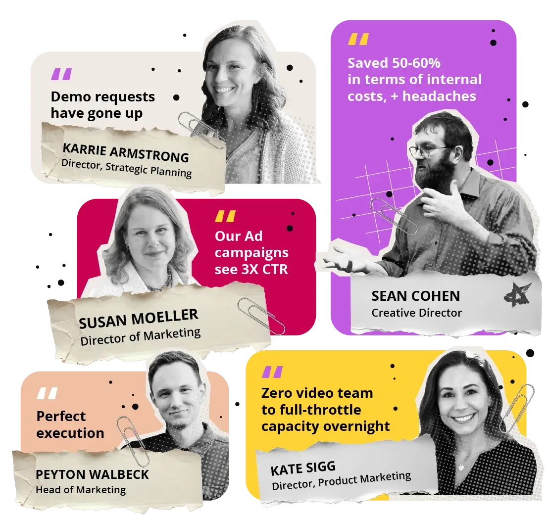
What is A Case Study Ad?
A case study ad is a proof-focused ad built around a real customer outcome. It highlights a specific challenge, the solution used, and measurable results.
Check out the key components of an effective B2B case study / case study ad:
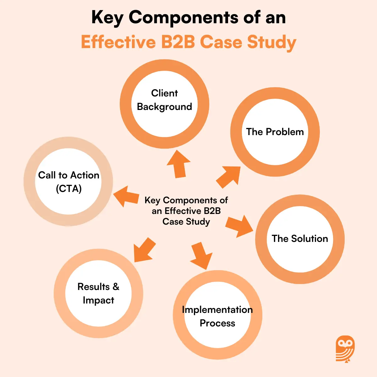
Unlike broad Linkedin ad examples that promote features or offers, a case study ad centers on transformation. It answers, “Did this work for someone like me?”
These ads are usually shown to warm audiences. They work best after engagement. The structure is simple: context, action, impact. Instead of hype, there is clear evidence that your solution delivers results in real scenarios.
15 Best LinkedIn Case Study Ads Examples
Below are 15 best LinkedIn case study ads examples that show how proof-driven ad creative design actually works in live campaigns.
Each one highlights a different structure, targeting angle, or sequencing approach you can apply in 2026.
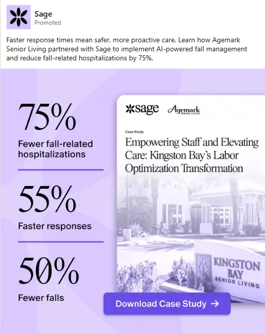
1. 75% fewer hospitalizations with Sage
Source: LinkedIn Ad Library
Best for: Healthcare facility directors
Industry: Healthcare
What Stands Out: Three metrics, one column. That’s the whole story. The case study cover makes the offer feel concrete, like a report, and not a generic landing page click.
Case Study Ad Strategy Review: This is a case study poster. The left column stacks three outcomes, each led by a large percent. The layout uses number tags/labels style treatment, so the eye can scan 75%, 55%, 50% in order without reading full sentences.
On the right, a tilted case study cover creates “this is a real download” credibility. The cover uses a muted, monochrome facility photo, so the metrics stay dominant. The CTA bar (“Download Case Study”) is large and centered, so action is obvious after the scan.
Quick Tip: If there are multiple results, stack them vertically and keep each line short. Put the downloadable asset cover beside the metrics to show what the click delivers. Use one CTA bar.
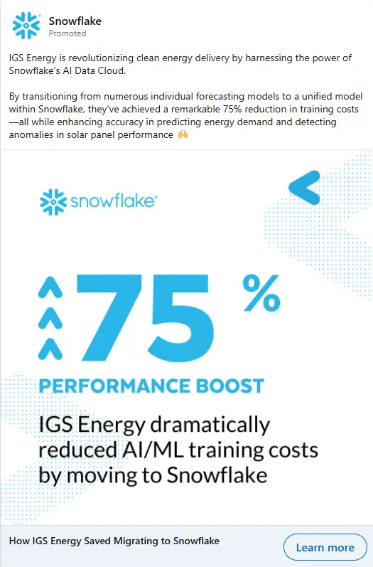
2. IGS Energy: 75% Performance Boost After Moving to Snowflake
Source: LinkedIn Ad Library
Best for: Data and ML platform teams
Industry: Energy
What Stands Out: The ad does not try to show a dashboard. It uses scale instead. The huge number and the arrows tell the story in under a second, which is ideal for LinkedIn feed speed.
Case Study Ad Strategy Review: This LinkedIn case study ad is built around one giant metric. “75%” takes most of the canvas, with a clear percentage sign treatment that makes the result readable even on mobile. On the left of the number, stacked upward arrows act as a visual cue for improvement, so the meaning lands before the sentence is finished.
The Snowflake logo sits top-left, then the rest of the space is kept clean and white to protect legibility. Light dotted patterns add texture without making the layout busy. The headline below the number explains the “why” in one line, so the stat does not feel random.
Quick Tip: If the case study has one headline result, make it the design. Give the number most of the space. Add one short line that explains what changed, and keep the rest of the background quiet.
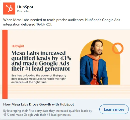
3. Mesa Labs Increase Leads by 43%
Source: LinkedIn Ad Library
Best for: B2B demand gen teams
Industry: Healthcare
What Stands Out: The layout feels like a magazine cover. Big result headline, clean spacing, then one portrait. The circular shape behind the subject keeps the composition balanced without adding clutter.
Case Study Ad Strategy Review: This ad uses a clean, editorial layout with one strong claim and one human visual. The left side is text-led, with the result stated in a single block so it reads fast in-feed.
The “43%” is the visual hook, helped by clear percentage signs and a heavier font weight. On the right, a rounded portrait cutout adds warmth and makes the ad feel less like a banner. The orange ring shape behind the person acts as a simple focal frame, pulling attention back to the hero area. The HubSpot mark is kept small, so the case study result stays the star.
Quick Tip: Use one percentage as the headline and leave the rest as supporting lines. Add a single portrait cutout with a simple shape behind it, so the viewer has a place to rest their eyes before reading the claim.
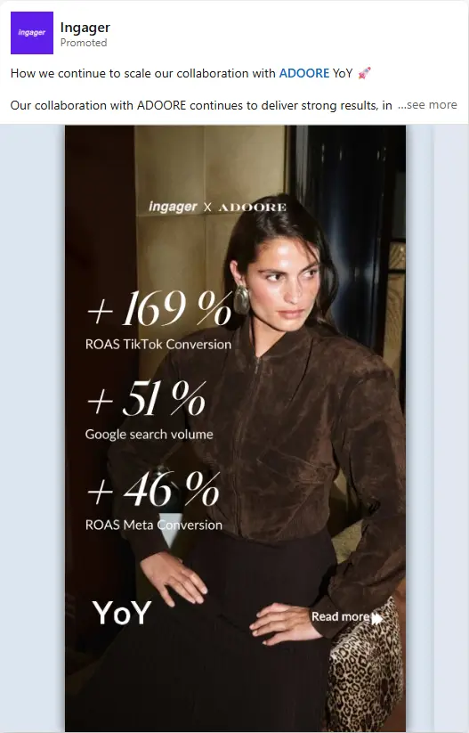
4. Ingager x ADOORE: Multiplying Results
Source: LinkedIn Ad Library
Best for: Performance marketers
Industry: Marketing
What Stands Out: The bold percentage numbers really catch the eye. They make it easy to understand the results quickly, which helps grab the attention of potential clients. The clean, sophisticated design adds credibility to the ad, making it look professional.
Case Study Ad Strategy Review: This ad highlights Ingager’s successful partnership with ADOORE. It focuses on impressive performance metrics, showing growth like “+169% ROAS TikTok Conversion” and “+46% ROAS Meta Conversion.” These stats are placed in bold, large text, making them easy to read and understand.
The use of before vs after stats effectively showcases the results. The number tags/labels next to each statistic make the impact clear. The model in the image, wearing a fashionable outfit, gives the ad a stylish, professional feel. This visual ties into ADOORE’s branding and emphasizes the elite nature of the brand.
Quick Tip: For LinkedIn ads case study, use bold performance stats, alongside professional visuals. This creates an immediate connection with your audience and displays real, measurable success.
5. Upside Drives Fast Growth for Grocers
Source: LinkedIn Ad Library
Best for: Retailers, Grocers
Industry: Retail
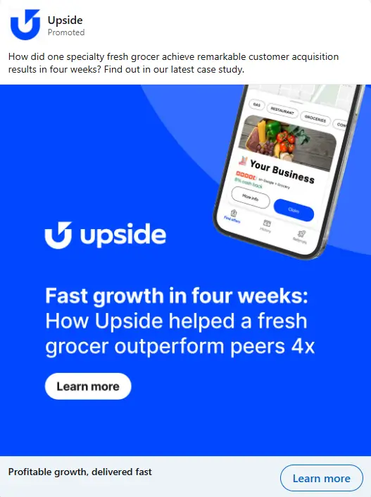
What Stands Out: The use of large, bold text with a clear value proposition, “Outperform peers 4x,” combined with the app interface image, clearly communicates the value Upside provides in a short time frame.
Case Study Ad Strategy Review: This ad focuses on Upside’s ability to drive fast customer acquisition. The visual uses a simple, clean display ad design featuring a bold headline text: “Fast growth in four weeks.” The blue background and prominent Upside logo instantly catch attention.
The ad presents the Upside app on a mobile device, displaying real-time usage with grocery-related images, aligning with the brand’s focus on retail. The product icon/image of the app in action emphasizes how easy it is for users to interact with the service. The message also uses an actionable CTA button (“Learn More”) to prompt users to engage further.
Quick Tip: Use clear, bold text with your brand’s product in action to show proven results and improve engagement in mobile-related case study ads.

Stuck with Canva templates & handshake stock photos to tell your Brand Story?
6. Flexport’s 100% Network Growth with Logiwa
Source: LinkedIn Ad Library
Best for: 3PL Providers, Logistics Managers
Industry: Logistics
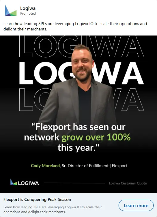
What Stands Out: The bold quote with the impressive growth statistic, paired with the client photo, strongly communicates the real-world success of using Logiwa’s platform.
Case Study Ad Strategy Review: This ad highlights Logiwa’s impact on Flexport’s network growth using their platform. The visual prominently displays the Logiwa logo at the top, followed by a quote from Cody Moreland, Senior Director of Fulfillment at Flexport. The quote, “Flexport has seen our network grow over 100% this year,” is placed in a bold, easy-to-read font, creating an impactful message.
The background is a clean, dark color with large Logiwa branding in the backdrop, ensuring the logo stands out. A client photo of Cody Moreland adds a personal touch and builds trust.
The testimonial quote box effectively highlights the customer’s endorsement, which is key for social proof. The CTA button, “Learn More,” invites engagement and directs users to the case study details.
Quick Tip: In LinkedIn case study ads examples, use a customer testimonial with bold stats, a professional image, and your logo in the background to create a trusted, high-performing ad.
7. Encova Insurance’s 98% Policy Intake Time Reduction
Source: LinkedIn Ad Library
Best for: Insurance providers, Automation leaders
Industry: Insurance
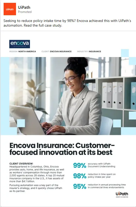
What Stands Out: The striking percentages featuring the efficiency gains, combined with the testimonial-style data and the professional image, effectively demonstrate UiPath’s impact in the insurance sector.
Case Study Ad Strategy Review: This ad emphasizes Encova Insurance’s remarkable achievements using UiPath’s automation technology. The visual begins with the Encova logo at the top. It is followed by a client photo of a professional employee interacting with technology, adding a personal touch.
The bold headline text, “Encova Insurance: Customer-focused innovation at its best,” draws attention to the company’s focus on customer-driven results. The bottom of the image includes key statistics, such as “99% accuracy with UiPath Document Understanding” and “98% reduction in time spent on policy intake.”
These results, shown in number tags/labels, make the figures stand out clearly. The clean layout, with contrast backgrounds, helps focus the viewer’s attention on the metrics.
Quick Tip: In LinkedIn case study ads examples, highlight key metrics using number tags/labels and bold headline text for maximum visibility in B2B case study ads, especially when showcasing process improvements.
8. Airbase Improves AP Processing by 75%
Source: LinkedIn Ad Library
Best for: Finance teams, Accounts payable managers
Industry: Finance
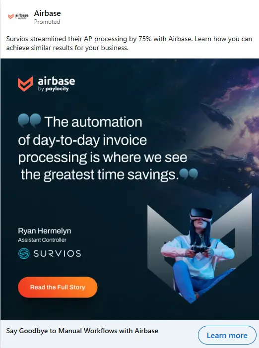
What Stands Out: The testimonial paired with a relevant, visually engaging background makes the ad feel both personal and innovative. The combination of a specific performance metric and an engaging visual narrative strengthens its appeal to businesses considering AP automation solutions.
Case Study Ad Strategy Review: This ad highlights the impressive 75% improvement in AP processing by Survios using Airbase’s automation. The testimonials from Ryan Hermelyn, Assistant Controller at Survios, are prominently displayed in a large quote box, emphasizing the time savings achieved through automation.
The visual design includes a high-tech, futuristic background featuring a VR headset, linking the image to the gaming industry (Survios’ core business) and reinforcing the cutting-edge nature of the technology used.
The bright CTA button (“Read the Full Story”) contrasts well against the background, urging users to engage. The Airbase logo at the bottom maintains brand visibility, creating an authoritative impression.All these strategies cumulatively make it a great fit for LinkedIn case study ads examples.
Quick Tip: Use a strong customer testimonial paired with a relevant background image that matches the industry, alongside a clear CTA, to improve engagement and action.
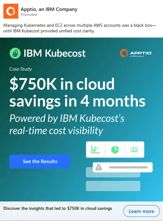
9. $750K Cloud Savings in 4 Months with IBM KubeCost
Source: LinkedIn Ad Library
Best for: Cloud Engineers, IT Operations Teams
Industry: Cloud Computing
What Stands Out: The focus on the specific dollar amount of savings and the use of icons to represent real-time data make the ad both informative and visually appealing. It immediately communicates the significant financial impact of using IBM KubeCost.
Case Study Ad Strategy Review: This ad emphasizes the powerful cloud savings achieved using IBM KubeCost. The visual displays the key figure of “$750K in cloud savings in 4 months” in bold headline text, immediately grabbing attention. The large text size and bright colors make the statistic impossible to miss.
The IBM KubeCost logo is prominently placed, ensuring brand recognition. Below the headline, smaller number tags/labels reinforce the message of “real-time cost visibility” to highlight the benefits of KubeCost.
The design also includes simple iconography, including a chart and sliders, which visually represent data analysis. This makes cloud savings and processes feel more measurable. The bright CTA button invites users to “See the Results,” sparking meaningful interactions.
Quick Tip: In LinkedIn case study ads examples, use clear, data-driven statistics in large, bold text paired with simple data visuals and a direct CTA to capture attention and prompt action in B2B ads.
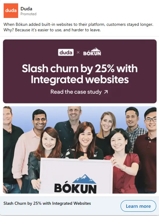
10. Slash Churn by 25% with Integrated Websites
Source: LinkedIn Ad Library
Best for: SaaS Providers, Product Managers
Industry: SaaS
What Stands Out: The focus on the clear 25% churn reduction combined with the personal image of the Bokun team creates trust. It also reinforces the message that the platform’s solution is both effective and reliable.
Case Study Ad Strategy Review: This SaaS case study ad demonstrates how Duda helped Bokun reduce churn by 25% through the integration of websites into their platform. The visual features a large, bold headline: “Slash churn by 25% with Integrated Websites,” which immediately conveys the key result.
The CTA button, “Read the case study,” is placed strategically below the headline, encouraging the viewer to click for more details. A client photo of the Bokun team adds authenticity, making the success story feel personal.
The bright purple background and contrast text improve visibility, ensuring the message stands out. This principle of design keeps the focus on the simple, proof-led statistic, driving the main takeaway.
Quick Tip: For B2B SaaS case study ads, combine impactful statistics with a team photo or real user image to build credibility and connect with your audience effectively.
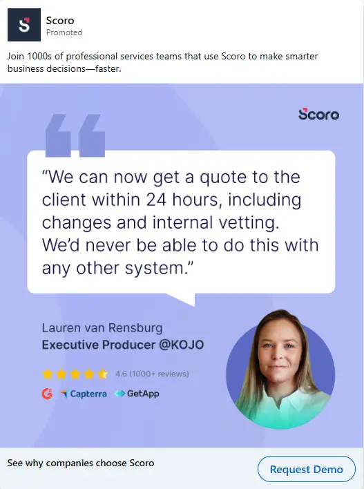
11. Scoro: Quote to Client in 24 hours
Source: LinkedIn Ad Library
Best for: Professional services ops leaders
Industry: Software
What Stands Out: In this snackable content, the quote bubble takes up most of the frame, so the message stays readable on mobile. The star row and review badges give validation in one glance, without extra charts or screenshots.
Case Study Ad Strategy Review: The whole design is built around a big speech-bubble quote, so the eye goes straight to the outcome. “24 hours” sits inside the quote, which makes the speed claim hard to miss. A circular headshot supports the proof and balances the heavy text block.
Below the quote, star ratings plus “1000+ reviews” add quick credibility without forcing anyone to read more. The row of review-platform marks acts like a mini client logo list, reinforcing third-party trust. This layout works well for LinkedIn ad examples because the proof is visible even on a fast scroll.
Quick Tip: If the ad is text-heavy, use one short outcome inside the quote (like “24 hours”). Then place star ratings and review-source logos right under it. In this way, trust lands before the CTA.
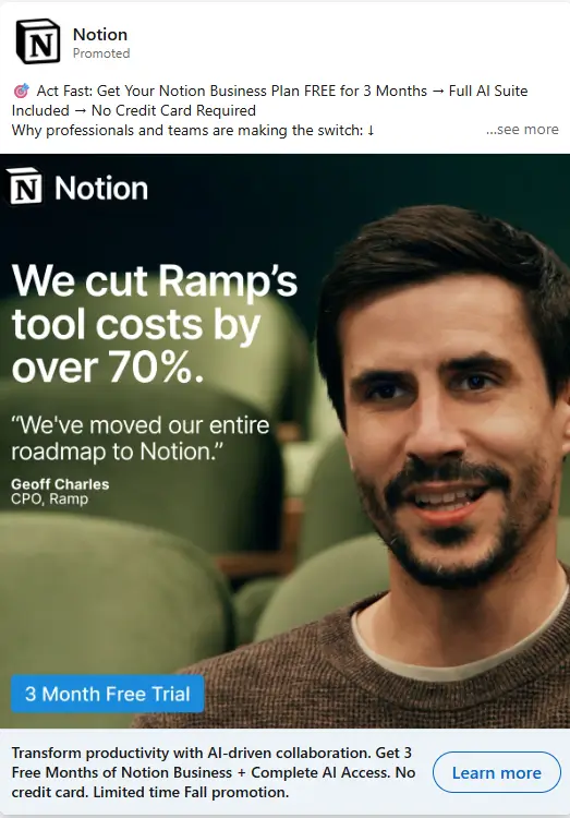
12. Ramp Cut Tool Costs by 70% with Notion
Source: LinkedIn Ad Library
Best for: Ops and finance decision makers
Industry: Software
What Stands Out: The result leads, not the product UI. One metric, one face, one quote. The blue trial box breaks the dark palette, so the offer stays visible even when the post is skimmed fast.
Case Study Ad Strategy Review: The creative uses a split layout that’s easy to scan. In the left side is the message, in the right side is a close-up portrait that adds human proof. The claim “over 70%” is the visual anchor, helped by clear percentage signs that pop against the dark background.
Under it, a short quote and the exec’s name/title make the story feel specific. Notion’s logo sits in the top-left, so branding stays visible without stealing space from the result. A bright blue highlight box (“3 Month Free Trial”) adds a second focal point and pulls the eye toward action.
Quick Tip: For LinkedIn case study ads examples using a big savings claim, keep the number as the headline. Add one supporting quote line and a clear title below it. Use a single highlight box for the offer.
13. Cognism X Tharsus: Open Rates Jump from 6% to 60%
Source: LinkedIn Ad Library
Best for: Demand gen and lifecycle teams
Industry: SaaS
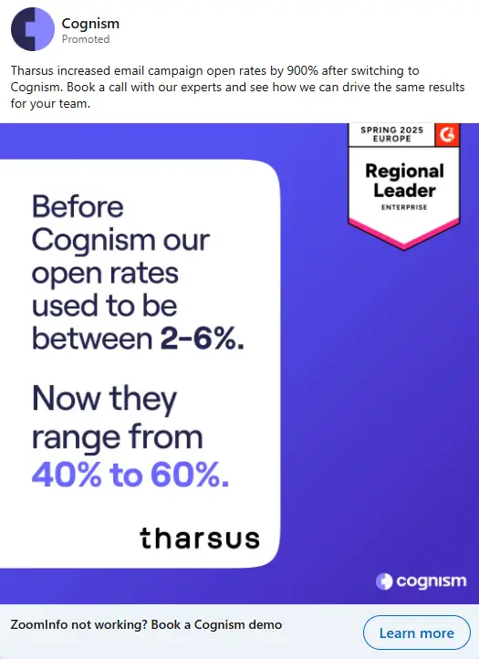
What Stands Out: The layout removes every distraction. One background color, one stat contrast, and one badge. The “after” numbers look heavier and clearer, which makes the change feel real even if someone only reads for two seconds.
Case Study Ad Strategy Review: This creative is built like a “result card” on a solid purple field. The story is told using before vs after stats in two lines: “2–6%” versus “40% to 60%.”
The “after” range is larger and brighter, so the eye lands there first. A small badge in the top-right (Regional Leader, Enterprise) adds third-party authority. The Tharsus name is centered at the bottom of the card, giving a clean end-point to the scan. Cognism’s logo sits small in the corner, keeping brand presence subtle while the numbers do the selling. This fits LinkedIn ads case study intent because the takeaway is visible in one glance.
Quick Tip: For metric-based LinkedIn case study ads examples, put the “before” first in plain text. Make the “after” larger and brighter. Add one trust marker (like an award badge) in a corner, then stop.
14. Workday: 50% Reduction in Time-to-Hire
Source: LinkedIn Ad Library
Best for: Talent acquisition leaders
Industry: Retail
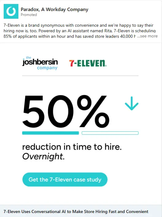
What Stands Out: The ad removes complexity. One number. One direction arrow. One short qualifier. The clean white background ensures nothing competes with the stat.
Case Study Ad Strategy Review: This ad is built around one dominant stat. The “50%” sits large in the center, using oversized typography so it becomes the visual anchor. A downward arrow next to the number reinforces improvement without extra explanation. The phrase “Overnight.” is placed on a separate line, giving the result emotional weight.
At the top, The Josh Bersin Company and 7-Eleven logos appear side by side, functioning like a subtle credibility row. The thin underline bars beneath the number act as visual dividers, keeping the layout structured.
The teal CTA button is centered and rounded, making the next step obvious. This works well for LinkedIn B2B case studies because the outcome is instantly clear.
Quick Tip: If the case study result is speed-related, pair the number with a directional arrow and isolate one punchy word on its own line. Keep partner logos aligned at the top to build authority before the viewer reaches the CTA.
15. Find misconfigurations fast with Prelude
Source: LinkedIn Ad Library
Best for: IT and security operations teams
Industry: Cybersecurity
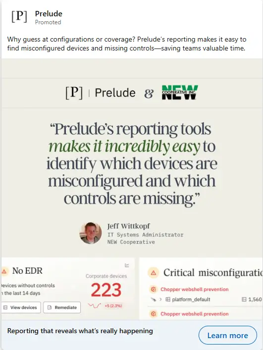
What Stands Out: The ad gives proof in three layers. Partner logos, then a named quote, then UI evidence. The big “223” number is a fast punch even if the rest is skimmed.
Case Study Ad Strategy Review: This ad is structured as a quote-first case study card. The top row shows both brands side by side, so the partnership is clear before the viewer reads anything. The quote uses typography contrast: most text is dark, while one phrase is emphasized in green, guiding the eye to the benefit.
Under the quote, the speaker block includes a small headshot and job title, which makes the statement feel owned by a real operator. The bottom strip adds two cropped product panels. One shows a big “223” count, which works like number tags/labels for impact. The other shows alert-style rows, which visually explain “missing controls” without extra paragraphs.
A subtle image overlay keeps the UI crops readable against the light background.
Quick Tip: For LinkedIn case study ads examples using UI crops, show only two panels. Pick one panel with a single big number and one panel with alert rows. Keep the quote above them. It helps the viewer connect the claim to what the tool actually surfaces.
The best LinkedIn case study ads examples don’t just share results. They place proof at the right stage of the funnel. Use these case study marketing collateral examples as a blueprint to structure timing, targeting, and storytelling with intent.
What Not to Do in LinkedIn Case Study Ads?
Not every LinkedIn case study ad builds trust. Some actually weaken your positioning and waste warm traffic. Here are three common mistakes, shown with real LinkedIn case study ads examples, that quietly hurt performance.
1. Mike King Recommends AirOps for AI search
Source: LinkedIn Ad Library
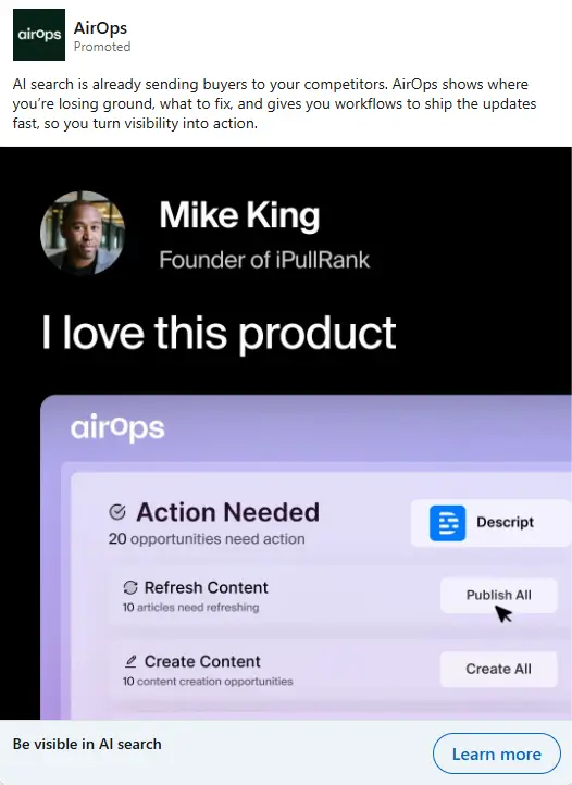
This looks like a testimonial, not a case study ad. The visual says “I love this product,” but shows no outcome, no metric, and no clear before/after. The UI crop is small and hard to read on mobile. There’s also no strong “what changed” headline tied to the screenshot.
Key Takeaways:
- A testimonial alone is not a case study. Without a clear metric or outcome, the ad feels like praise, not proof.
- Always show what changed. Add one concrete result, such as traffic, revenue, or time saved, to make the story credible.
- Make the visual support the claim. If you show the product UI, ensure it directly connects to the outcome stated above.
2. Sanity: Immersive, Editorial Shopping Experiences Made Easy
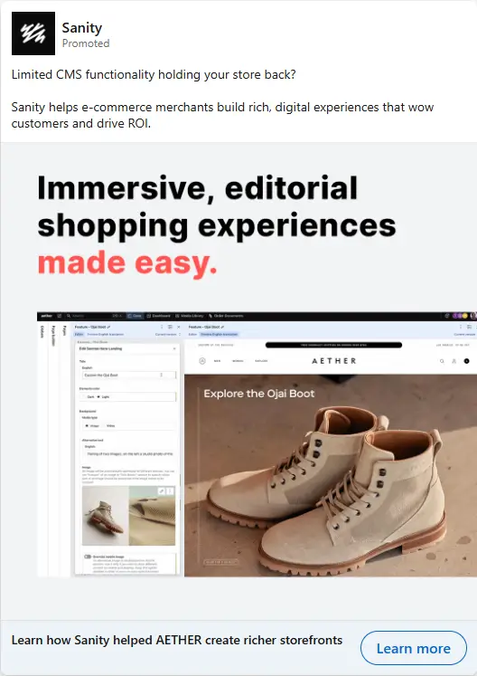
Source: LinkedIn Ad Library
This looks like a product feature ad, not a case study. The headline sells “made easy,” but shows no customer result. The creative mixes two worlds (editorial promise + product depth) without a clear visual path. The CTA “Learn more” button sits far below the main headline, so the next step is not immediate.
Key Takeaways:
- Keep the headline specific to the customer scenario, not a broad promise.
- Build one clear visual reading path: claim → proof → customer name.
- Place the CTA closer to the main message so the next step feels obvious.
3. Simplify Internal Communications with Workvivo
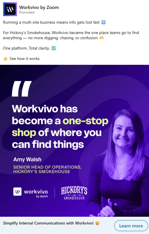
Source: LinkedIn Ad Library
The purple tint covers the entire photo, so the person looks less real and more like a template. The quote is still a broad slogan (“one-stop shop”), not a specific outcome. There is no visual hint of the product, so viewers cannot connect the claim to anything tangible.
Key Takeaways:
- Keep the photo natural. Heavy color tints reduce trust.
- Replace slogans with one clear result people can repeat.
- Add a small product glimpse, so the promise feels believable.
4. TED x Riverside Time-Savings Proof
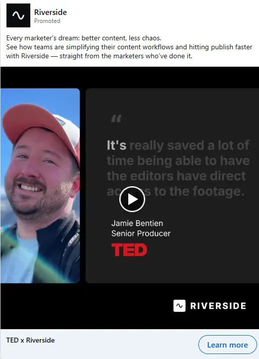
Source: LinkedIn Ad Library
The quote is long and wordy, so the main point gets buried. “Saved a lot of time” is soft, since it gives no size or timeframe. The thumbnail looks like a static card, so some viewers may miss it’s a video. Riverside branding is also easy to overlook next to TED.
Key Takeaways:
- Shorten the quote to one sharp outcome line.
- Make the benefit concrete with a number or time period.
- Make “this is a video” obvious with a stronger play cue.
Avoid these mistakes, and your case study ads will feel credible instead of forced.
Stuck with Canva templates & handshake stock photos to tell your Brand Story?
Why Use LinkedIn Case Study Ads?
LinkedIn case study ads work because they answer the question every B2B buyer is already thinking: “Has this worked for someone like me?”
They are not meant to introduce your brand. They are meant to remove doubt. That’s a big difference.
Here’s why serious LinkedIn advertisers rely on them:
- They convert warm traffic better than cold traffic: When someone has watched 50% of your video or clicked a document ad, they’re curious. A case study ad meets that curiosity with proof.
- They lower perceived risk: Buyers don’t want features first. They want outcomes. Showing a clear challenge → solution → result flow builds confidence quickly.
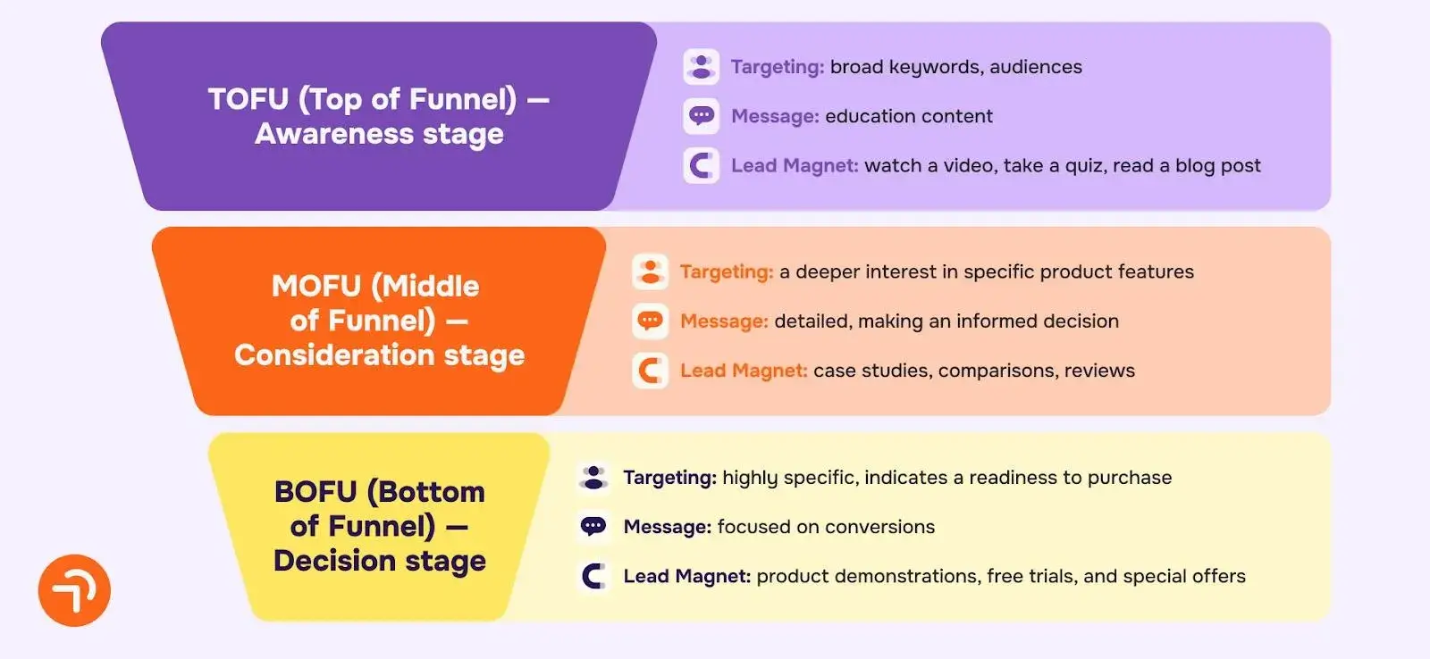
- They support layered campaign structure: Cold ads teach. Mid-funnel ads prove. Bottom-funnel ads ask. Case study ads sit perfectly in that middle layer and bridge awareness to action.
See how the LinkedIn Ads Sales Funnel looks like:
- They improve lead quality: When prospects see metrics, timelines, and real use cases before submitting a form, the conversation with sales changes. They come informed.
- They shorten the sales cycle: Instead of explaining “how this works” on every call, your ads pre-handle objections. That speeds up decision-making in the B2B sales cycle.
- They reinforce positioning: A well-written case study ad makes your ICP obvious. Industry, role, use case, everything becomes clear in seconds.
Used correctly, LinkedIn B2B case studies are not hype pieces. They are structured proof assets.
But timing matters. Run them too early to cold audiences and they feel heavy. Run them to recent engagers, and they feel relevant.
In 2026, as LinkedIn costs stay competitive, proof-driven creative is no longer optional. It’s the difference between traffic and trust.
When to Use LinkedIn Case Study Ads?
LinkedIn case study ads are powerful. But timing decides whether they convert or waste budget.
They should not be your first touch. They work best when the buyer already knows who you are.
Here’s when to use LinkedIn case study ads:
- After engagement signals: Run them to people who watched a significant portion of your video, clicked a document ad, or visited key pages. These users have context. Proof now feels relevant.
- Inside a 30–90 day retargeting window: Recency matters. A LinkedIn video marketing case study shown months later loses impact. Keep the audience fresh and tight.
- When sales cycles are longer than 30 days: In B2B, buyers need reinforcement. Case study ads keep your solution visible while they compare vendors.
- When lead quality drops: If you’re getting form fills but poor-fit leads, introduce case study ads before the conversion ask. Let prospects self-qualify through industry and use-case clarity.
- Before high-intent offers: Planning a demo push? Run LinkedIn ads case study for 2–3 weeks first. Warm the audience with outcomes, then introduce the direct CTA.
- When launching into a new vertical: If you’re targeting healthcare, fintech, or SaaS specifically, lead with a vertical-focused case study. It secures your positioning fast.
Avoid running them to broad cold audiences. Without familiarity, results-heavy ads can feel dense.
Think of LinkedIn case studies as mid-funnel proof assets. They connect early education with late-stage conversion.
Used at the right moment, they don’t just generate clicks. They build trust that carries into pipeline conversations.
Why Are More Advertisers Adding Case Study Ads to Their Campaigns?
More advertisers are shifting budgets toward proof-led creative.This is because it performs better in layered LinkedIn funnels.
Here’s what’s driving the change:
- Cold traffic is more expensive: With rising competition, brands can’t rely only on awareness ads. A well-structured LinkedIn case study ad gives warm audiences a stronger reason to convert.
- Buyers research longer before booking calls: Decision-makers compare vendors quietly. LinkedIn ads case study show outcomes early, so your brand stays credible during that evaluation phase.
- Lead quality matters more than volume: Many teams learned the hard way that cheap CPL (cost-per-lead) doesn’t mean pipeline. Proof-based ads filter out poor-fit leads before sales ever gets involved.
See the difference between CPL and pipeline here:

- Retargeting is more sophisticated now: Advertisers can build segments based on 30-day engagers, document viewers, or website visitors. Case study ads fit naturally into these mid-funnel layers.
- Trust beats features: Product-led ads explain what you do. LinkedIn ads case study explains what changed for someone else. That shift from feature to outcome is why many of the best linkedin ads today are proof-driven.
- Sales teams are demanding better pre-qualification: When prospects see industry, timeline, and measurable impact in the ad itself, calls move faster. Fewer “just exploring” conversations.
- Campaign structures are becoming more intentional: Cold = teach. Warm = prove. Hot = ask. Case study ads sit squarely in that proving stage.
In 2026, advertisers are not adding LinkedIn case study ads for variety. They are adding them because layered campaigns need credibility in the middle. Without proof, awareness fades. With proof, momentum builds.
Improve Your Case Study Ads with Content Beta’s Creative Expertise
Strong proof deserves a strong presentation. Many teams collect wins but struggle to turn them into structured, scroll-stopping ad creative. That’s where execution matters.
At Content Beta advertising design company, we help B2B brands translate raw customer stories into performance-ready assets, from document ads to short proof-driven videos. Instead of copying generic Linkedin ads examples, we build case study ads around audience temperature, buying stage, and campaign sequencing, all while maintaining brand guidelines.
The result is simple: clearer positioning, better-qualified leads, and creativity that supports your full funnel, not just a single campaign push. Get in touch with us now.
Frequently Asked Questions (FAQs)
How do you write a LinkedIn ads case study?
Start with the customer’s specific challenge and why it mattered to their business. Then show what you did, include measurable results, and keep the structure tight so the outcome is clear within seconds.
What were the LinkedIn ads updates in November 2025?
In November 2025, LinkedIn updated its Ads Agreement and data-use terms, clarifying how “Campaigns” and audience data are defined. The update also expanded how Audience Data can be used to improve advertising services with affiliates like Microsoft. These changes also included new controls around data use for AI training and ad personalization that marketers should review before launching a campaign.
What is a good LinkedIn case study template?
A good LinkedIn case study template follows a simple flow: clear challenge, specific action taken, and measurable results. Keep it short, industry-specific, and focused on outcomes so readers understand the impact within seconds.
We create strategic design assets for 200+ B2B & SaaS companies.
Sales presentations, Marketing collateral, Website graphics, Ads Creative and more.